

Short on time? Jump Past the Fluff.
If you are busy with multiple portfolio reviews, then let’s not waste any of your precious time. Skip the background story and jump straight into the details of the assignment — starting with the company background.
February 20th, 2025. Its 8:15AM, and my phone is ringing.
When I got the call from SMRT Systems CEO, Bill Alber, inquiring if I was available to work with him, I was oddly relieved for a couple of reasons: On one hand, with the new administration, work was still in a rocky place—and more work is always welcome. On the other hand, Bill has a software company, and having spent some time working on websites, I was hoping to be back in the proverbial “saddle” that is working on software.
Why? Software work is fun, rewarding, and in my mind’s eye, feels like a much “purer” version of design than any work that I could be doing with websites.
To be clear, it’s not that I think web work sucks, or that I am inclined to avoid web work, so much as it is that web work—be that working in code or designing with page builders—feels like a demonstrably more restrained production process when it comes to making new things. For as much as code serves as—and is governed by—its own set of production rules and standards, there are also rules and standards on top of coding such as SEO which governs how text is written and displayed. Taking this a step further, the incorporation of UX standard practices for web serve as their own rules and standards for making things usable.
While at the end of the day, this concept of rigidity is merely an illusion, in app design it doesn’t always feel nearly as felt—despite the fact that the rules surrounding how things are made hardly disappear in their entirety. Platforms like Figma serve as ideal testing grounds for ideas because of their ability to articulate concepts from a purely visual space. This gives designers room to work in freehand, openly experiment, and try ideas without their production software of choice proverbially shitting the bed when something isn’t immediately possible in a specific code base. Of course, the obvious trade-off here is that for as much freedom as freehand app design seems to provide on the surface, ultimately these freedoms are grounded by the same set of rules that can typically be found in web design.
Regarding the part of my aforementioned relief that was best described as “odd,” however, the reason is simple: as it relates to my career, my working relationship with Bill has a unique history to it. On one hand, I credit Bill for being the guy that got me into UI/UX design—and as someone who not only loves this field, but has seen my involvement in it as a reason to increase my software development skills and aspire towards a founder role, that means something. It is while working with Bill at the beginning of my UI/UX design career on his software service called SMRT, that I became acquainted with the practice of application design itself, was given an opportunity to heavily experiment, develop my skills, and eventually build a large enough repertoire to move on to opportunities with both AndiSites and the U.S. Army.
On the other hand, it cannot be forgotten that those initial years as a UI/UX designer under Bill were very chaotic. While in hindsight, I can say that this was by and large associated with the growing pains of learning new things—these growing pains were experienced by both Bill and myself, and negatively affected the production process in some important ways. While I was effectively learning as I went on how to produce good interfaces, Bill was developing a more sophisticated understanding of what the software design process even called for, the role of software design tools, how to implement features, work flow methodologies, and the intrinsic limitations that exist while using design tools. In the end, our combined efforts after almost a year and a half of working together resulted in a design that could not functionally be implemented by his development team.
As one would suspect, this result ultimately lead to a sentiment of mutual frustration on both of our ends. On Bill’s end, he was trying to leverage every resource available to him to publish a quality piece of software—and was falling short because he had effectively hired the wrong person. On my end, I was effectively taken out of a more traditional marketing design career trajectory to deliver a work product that wouldn’t advance my career in any material ways. At a time when I really needed to ground myself by maximizing my number of viable work examples, I took a risk on UI/UX and had little to show for it.
Though Bill tried to make up for this by positioning me in other roles at his company, these roles were not UI/UX related. The inconvenient reality at the time was that I no longer wanted to be a marketing designer, and knew that any role that wasn’t in UI/UX would ultimately leave me feeling unsatisfied with my job. In the end I left SMRT, but in the interim, I honed my UX knowledge for both websites and apps through self-taught methods, I ended up on a projects for The University of North Carolina, the North Carolina Dept of Justice, and the US Army—and generally speaking, got better all around. But most importantly, I didn’t just make things, I made things that could be—and were—produced.
In the years following my departure at SMRT, my phone would ring every once in a while on a random morning, and Bill’s name would appear on the caller ID. When the moment would strike me, I would pick up the phone, we would catch up, and sometimes the call would end with him seeing if I was available to work together—and admittedly, I would typically say no.
This time, however, was different. The economy was under threat, changes in political climate were having rapid effects on the work force—especially for people of color—and a desire to work with someone that was familiar to me, knew me, and I had a pre-existing relationship with was very high. But there was also another hope: that over the years I spent turning down Bill’s offers for me to come back, that he had finally built a team for himself that would help him produce quality software—and honestly, save him from… well, himself.
So in almost several years since I stopped working with Bill, when I was asked if I had some time to come into the office and meet his new design team, I naturally said yes.
In the years since my initial departure at SMRT, Bill managed to grow his team to a legitimate core of a little less than a half dozen individuals. On the side of app design, SMRT and Bubblepay were being anchored by the efforts of one Lead UX designer, Ruchira Biswas—who I would ultimately have the pleasure of working with on both projects for both the Bubblepay Kiosk and Customer app. Ruchira was flanked by a core of several full stack developers, Sidharth Anil—or “Sid”—who was working primarily on the Kiosk’s back end, Himanshu Singh—who was working on the Kiosk’s front end—and Junaid Saleem. Though these team members are all people that contributed to the development of Bubblepay’s kiosk and customer app, all of these team members, are also key contributors on SMRT Lite. Finally, all of these efforts were being managed by one Prakhar Lohiya, who serves as the project manager for both Bubblepay and SMRT Lite.

PRAKHAR LOHIYA
Project MGR.

RUCHIRA BISWAS
UX Lead

CLIFF BRETT
UI/UX Consultant

SIDHARTH ANIL
FS Developer

HIMANSHU SINGH
FS Developer

JUNLAID SALEEM
FS Developer
In the days of old, times were different: functionally speaking, there was no team. While sure, SMRT had worked with people before me who were skilled in design, many times these people would serve on staff as one of the only designers—if not, the only designer—which can put lots of undue burden on that individual. Even in my initial run at SMRT, I did not only serve as the main UI designer. I also served as the main marketing designer, the main web designer, and the main brand designer.
On the topic of UI/UX, by serving as the only designer under SMRT, the company’s proverbial “design team” was effectively comprised of Bill and me, and for such reasons, my efforts were directly influenced by Bill’s input—for better, and for worse. While on one hand, I knew that my work product had the approval of the most important person in the company, on the other, because this person did not have a working design repertoire, their inputs—and their approval—was heavily flawed. And though it is hopefully obvious that this input never came from a place of malice, it nonetheless had the ultimate effect of holding back the development of SMRT’s product.
To be clear, the situation I went through was hardly unique. There are plenty of designers that can recount times when they were obligated to work in lock step with a CEO, department head, or some other executive who was not indoctrinated in technical design foundations, yet had the power to impose their will on the design process. In the case of Bill, however, he did not feel a need to impose his will on the product because he was the CEO. He felt a need to do so because he fashioned himself as a designer.
Naturally, some may wonder what intrinsic value there is in a professional title. But in so many words, when non-designers fashion themselves as such—either as the result of consuming online content, completing a certified course, or just because it sounds cool—the knock-on result is that these same individuals can have a hard time trusting the input of qualified professionals. While I am avowedly the last person to dispute that there is such a thing as design thinking, plenty of non-designers think that simply being a “design thinker” makes them a designer. In reality, that is only half of the discipline. The other half is having a technical repertoire that can match the quality of the conclusions a designer makes. Put another way: regardless of how good an individual’s UX conclusions are, at the end of the day they still have to have some foundation in knowing how to make shit.
In the professional world, beyond superficial reasons such as attaining the respect of your peers, there are practical reasons for this that can relate to managing user sentiment, shortening user throughput, and reconciling your work with real and tangible technical limitations—among other things. At the end of the day, regardless of what organizational sway an individual has, nothing will ever be a stand in for that knowledge.
Ultimately, the presence of SMRT’s design team signifies in so many words not just a swelling of it’s ranks in design, project management, and software development: it represents a paradigm shift for the company itself—and one that places the expertise of professionals at the center of the process, instead of the organizational weight of any one high-ranking operative. Getting to this point likely took lots of outside conversation, consultation—and ultimately personal development—on Bill’s part, because of the high premium that he places on being able to trust the people that he works with.
From my perspective, that clearly started with Prakhar. After graduating from Duke University, Prakhar was picked up by SMRT to work with Bill as a project manager—and from what I can see, helped him make that shift towards trusting the talent of the professionals surrounding him. Between NC State, Duke University, and Chapel Hill, SMRT has had access to some of the best professional talent in the country—and has consistently recruited from these places. But despite having success in recruitment from top universities, that talent hasn’t always been used to the best effect. Prakhar played a big hand in changing that dynamic. Being the project manager, Prakhar built a team of likeminded professionals around key production roles in a software development workflow. Despite having some measure of design capability, he needed a dedicated UX design professional—so he grabbed Ruchira from NC State, which has one of the best design programs in the nation. On top of that, he would also need to expand the existing corps of engineering talent to support that designer, so he grabbed key players like Sid from Duke.. These changes also proved to be necessary because as it stood, much of the existing talent was stretched thin between platform updates, web development, and marketing automation.
Despite these inconveniences, building the team seemed to be relatively easy: while some members of the SMRT team are clearly individuals with relationships to one another outside of work, Prakhar would nonetheless recruit based on who fit his cultural dynamic. To clarify, what is meant by this is simple: Prakhar wanted to not just see if his chosen candidates were “good,” but that they could partake in the larger organism that is his team. Short of living together, Prakhar’s team do everything else as a unit: They eat together, the socialize together in off hours, have a similar sense of humor, push crunch periods at similar times, and as Indian immigrants, Prakhar’s team also has a shared language. While some may find this final detail as having potentially dubious implications on the topic of workplace nepotism—love it or hate it, Prakhar’s methods seem to work.
It was in arriving at the office that Bill introduced me directly to Ruchira, Prakhar re-introduced himself to me, and I was given a quick tour of everything Bill’s team had been working on in the years since I had left—from updates to their mobile app design, to the creation of SMRT lite and their work on a recently-acquired payments service called Bubblepay.

An example rendering of the machine connectivity device that enables digital payments in washing machines.
Bubblepay is the type of service that can readily be ex plained in a nutshell: it is a digital payment platform for laundromats that facilitates transactions between smartphones and laundry machines.
Originating as an Australian digital payments company that services laundromats, Bubblepay was purchased by SMRT in 2024 with the intention of being launched in the United States as SMRT’s product arm for laundromats and wash/dry/fold services. At the time of this writing, Bubblepay has around 400 subscribers between its Australian and US markets, with most of its customer base primarily consolidated in Australia.
 The Bubblepay kiosk experience represents a natural evolution in Bubblepay’s vision of fully digitized laundromat payments. Per Bubblepay, modern-day laundromats face the challenge of reconciling a fragmented user experience—with examples of usability fragmentation including exact-change requirements, language barriers, invisible machine availability, opaque pricing, and a host of other problems.
The intention of the Bubblepay kiosk was to address the aforementioned challenges that currently characterize laundromat payments. Simultaneously, as a cashless solution, the Bubblepay kiosk’s ideal use case is in helping laundromat owners fully realize a fully autonomous, cashless laundromat solution.
With this particular end in mind, SMRT’s interest in—and ultimately, acquisition of—Bubblepay aligns perfectly with their interests in automation and closed loop productivity systems that thrive on a minimal number of humans in the loop. Unlike dry cleaning, however, SMRT realizes that if they can successfully deliver a cashless, reliable, automated POS laundromat solution, that would open the door to an entirely new kind of business model that would effectively trade minimal levels of maintenance for maximal levels of hands off profit. In this unique vision for automated laundromat operations, the Bubblepay Kiosk would also operate like a digital storefront for the physical location.
Because Bubblepay’s kiosk is a system that prioritizes the use of digital payments—be they cards or apps—in so many words, it exists to operate as a stop gap to help address the needs of users that do not have the customer app installed on their phone. It simultaneously exists to help service laundry payments systems that are already running on a proprietary card technology by accepting those cards as a form of payment.
When I first arrived at SMRT offices, it wasn’t entirely clear why I was there. I started my week off with an assignment from Bill to work on some advertising-related design projects, but by the early afternoon a couple of days later, the real reason for me being on site rose to the surface: Bill would like me to work with his team on helping visually refine the user interfaces for the Bubblepay Kiosk, as well as the Bubblepay Customer App (which will be discussed in a separate entry).
Despite the fact that Bubblepay already had reasonably well-designed customer and employee apps already in development, it was clear that the kiosk was a new addition to their hardware wheelhouse. For such reasons, its user interface and user experience were comparatively underdeveloped when juxtaposed to other products in the same ecosystem.
And while I’m obviously being a comedian right now, I also want to point out that this is also ok. The goal of the early designs for the Bubblepay kiosk interface was to engineer the inner workings to function well with laundry machines. It was also put in place to make important data-driven discoveries about the flow of the layout itself. The original interface did that well. The next step, however, is to actually make the system presentable so that it could ultimately be taken out of test conditions, and brought to market—if some visual fluff in the user flow can be removed along the way, that would be nice too.
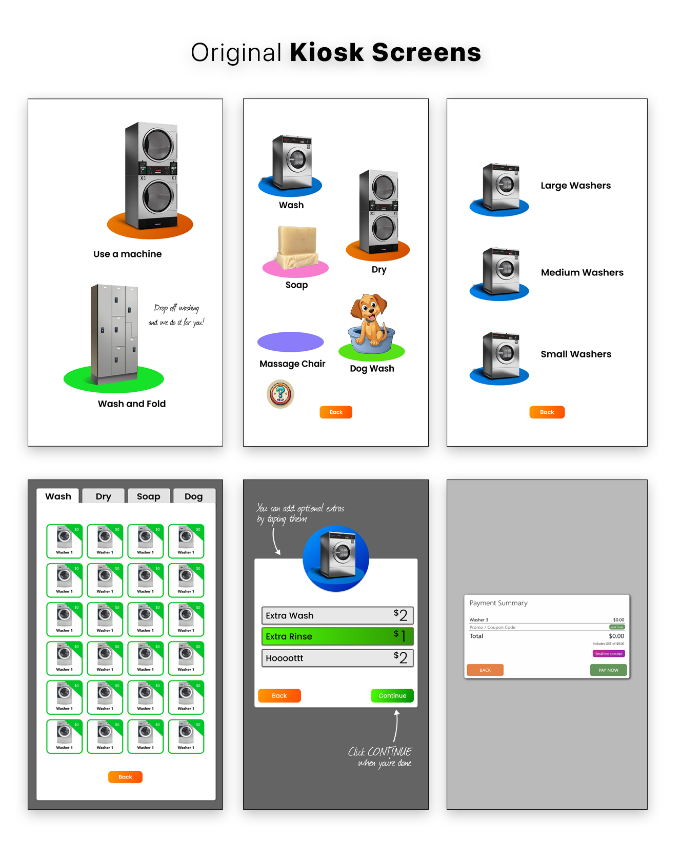
Because Ruchira was preoccupied with rendering a series of backlogged design updates for SMRT Lite, I was brought in to take point on the initial re-design process for the Bubblepay Kiosk while she focused on any work she had to do with SMRT Lite.
The kiosk itself already had certain things about it that were figured out: first and foremost, the creators of it had a very clear use case for the kiosk in mind, and that is as a fully-automated, hands-off, POS solution. On top of use case basics, the kiosk already had a general concept in mind for user flow, so any additional UX considerations would end up being fairly light.
Most crucially, I was brought in to achieve the following goals:
1. Make the existing interface look nicer – Really and truly, this is a euphemism for needing to re-design the whole thing. Because the interface consisted of a goofy cartoon-inspired design system, making the interface look nicer literally meant taking the time to completely re-envision its UI considerations. Part of why Bill wanted me to work with Ruchira is that he was aware that I have lots of skill in anthropomorphic visual design, and thought I could be of use in helping deliver an interface that is built around more physically-inspired visual cues. Generally, this approach was at odds with Ruchira’s specialization, which is primarily flat design. As far as what was a preferred approach, there was an early consensus between Ruchira and me that a hybrid look between anthropomorphism and flat design would likely produce the best result.
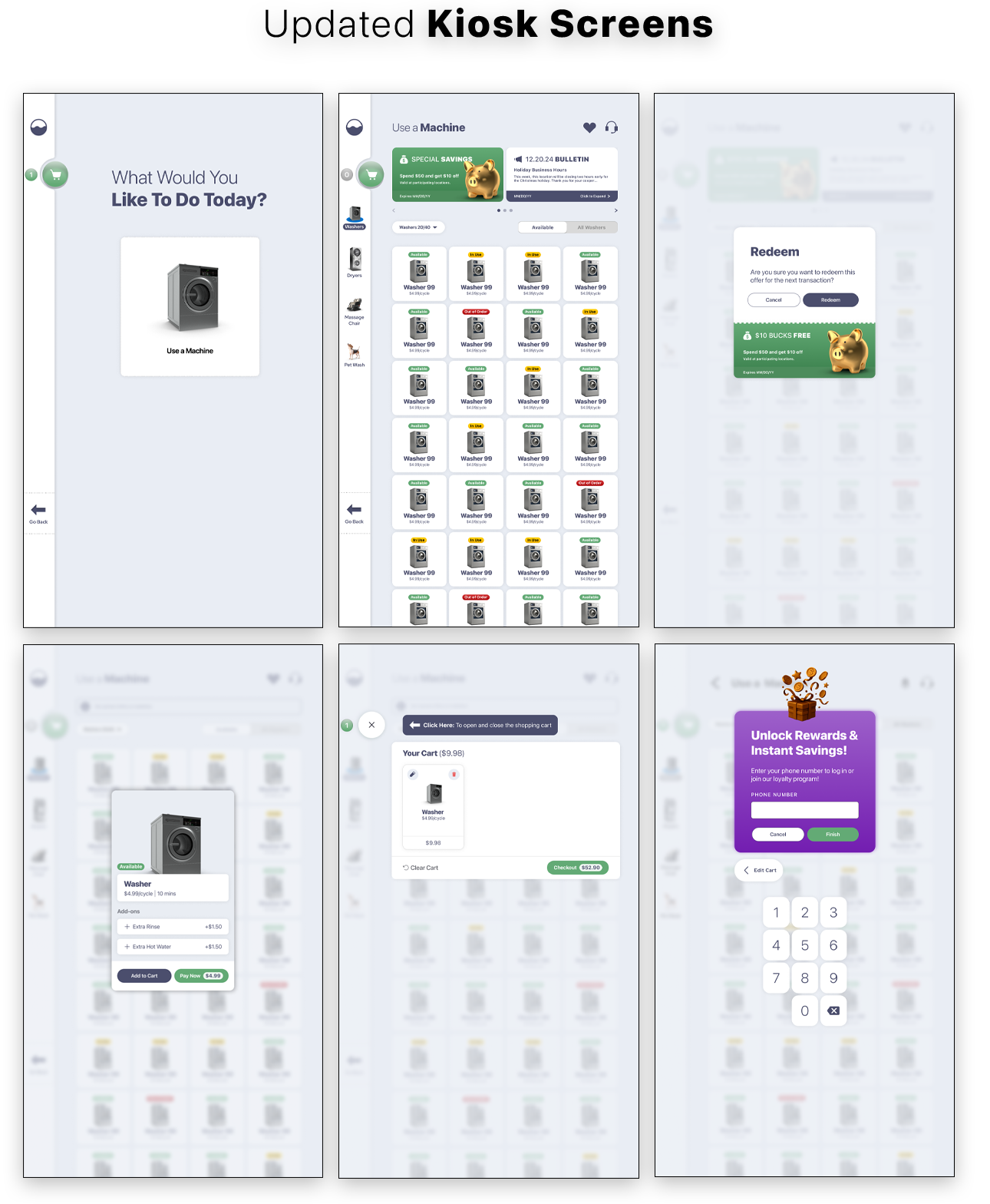
A HYBRID APPROACH
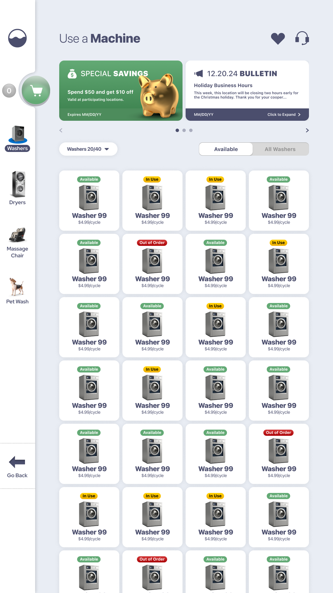
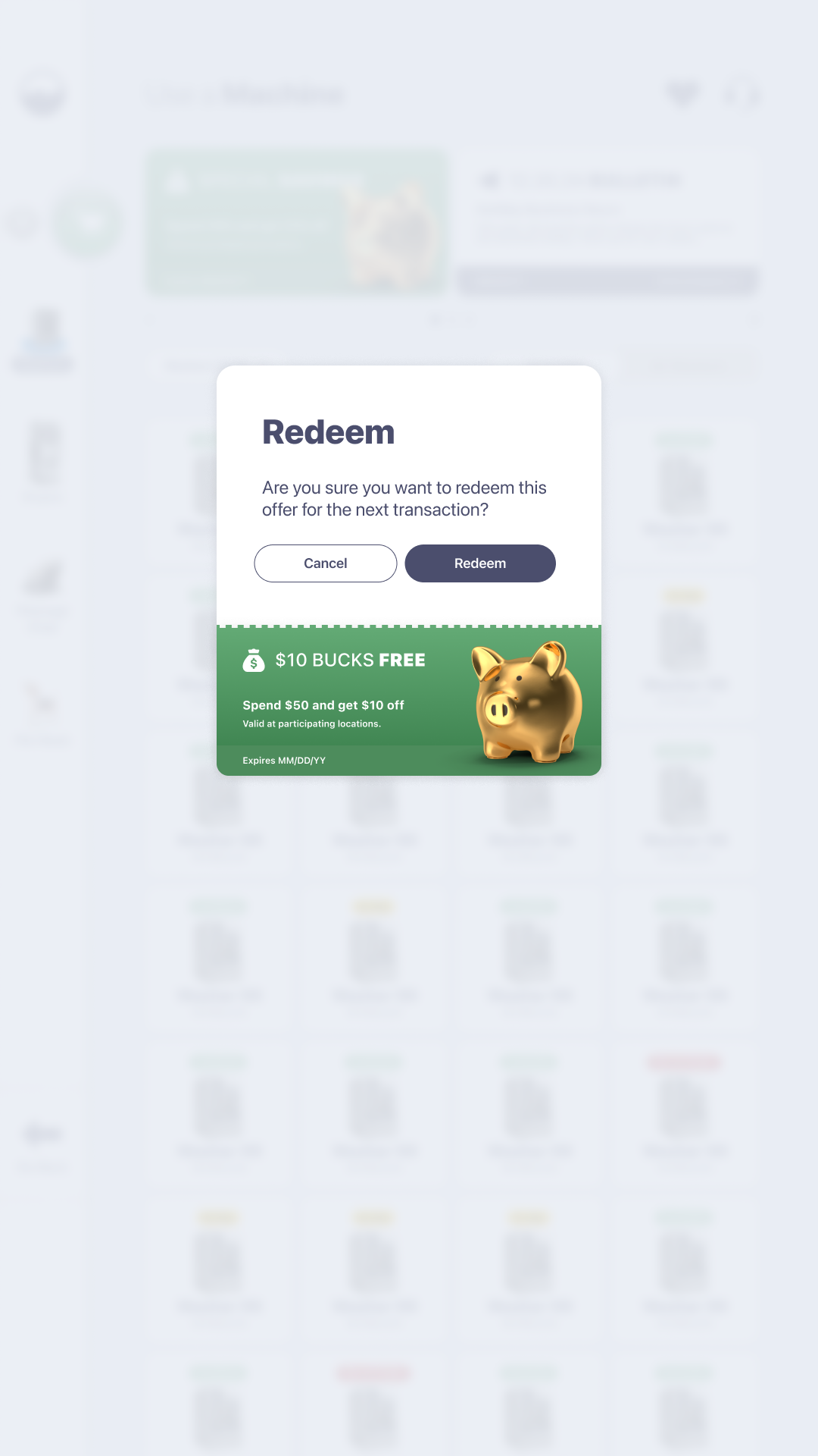
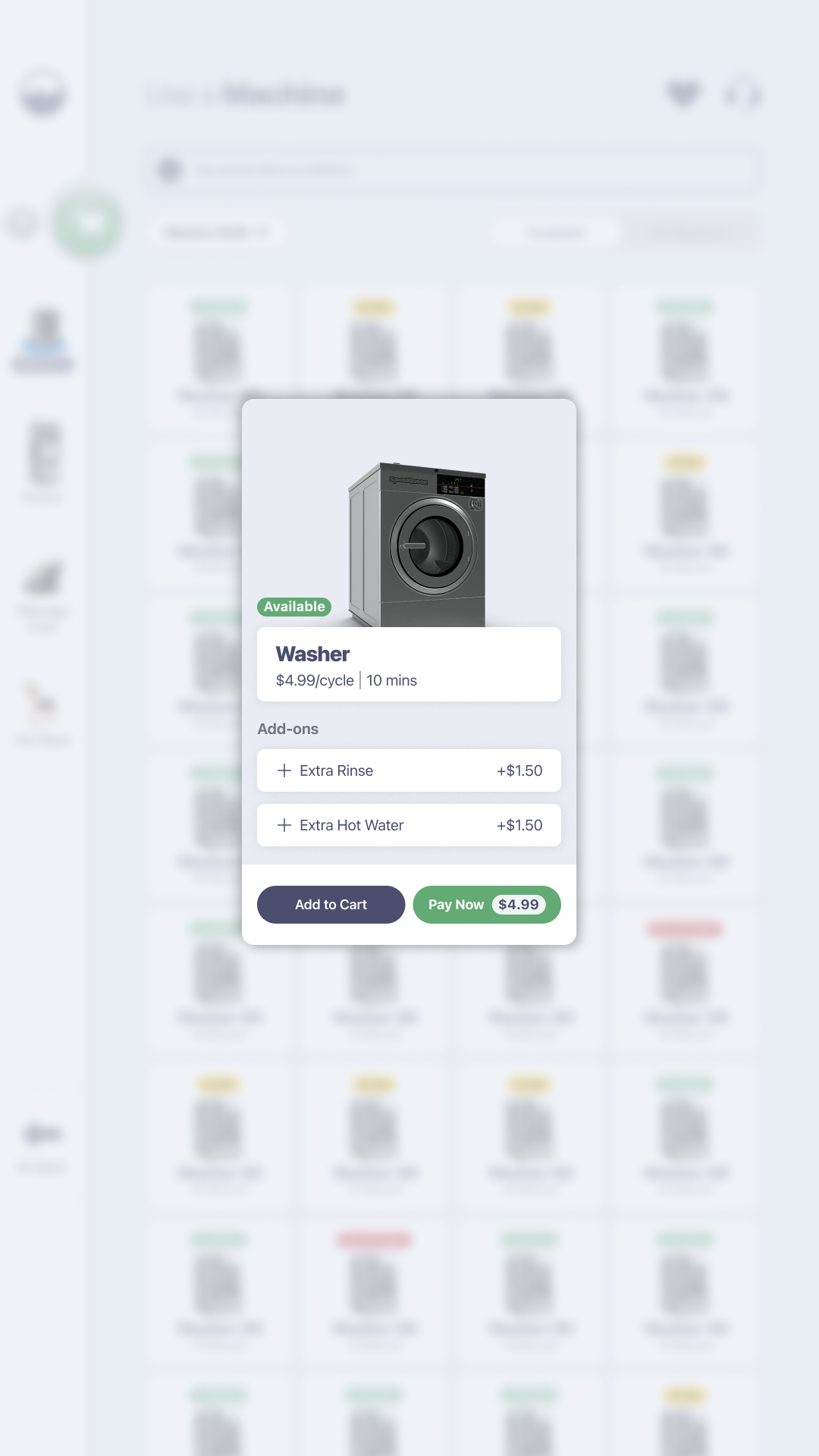
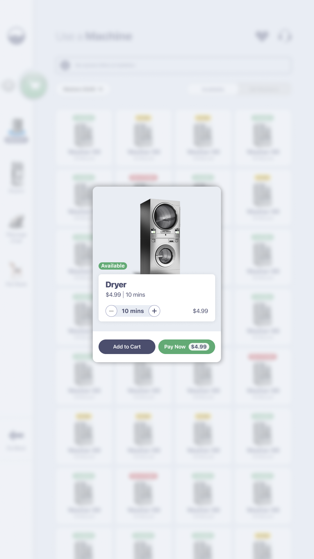
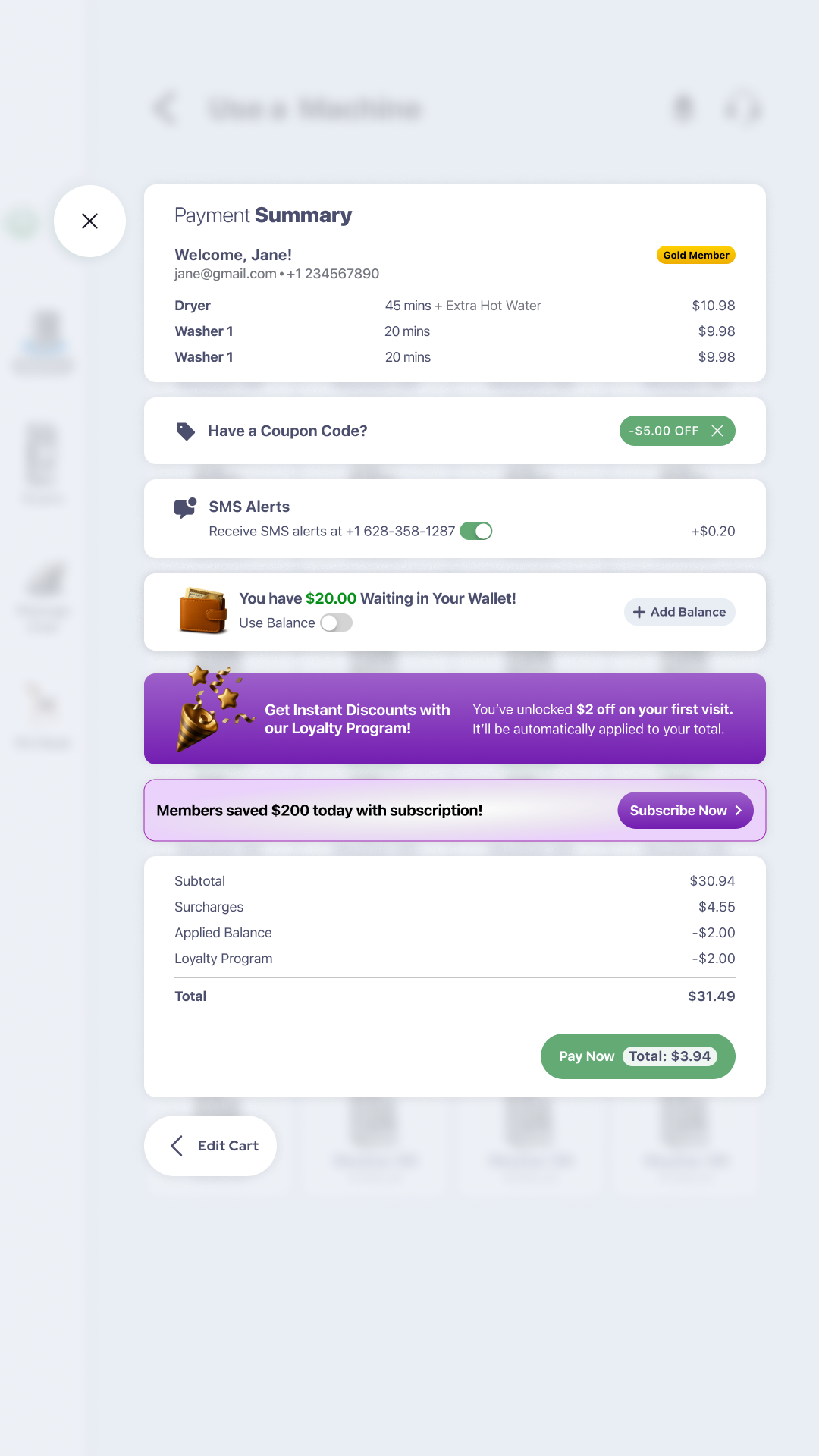
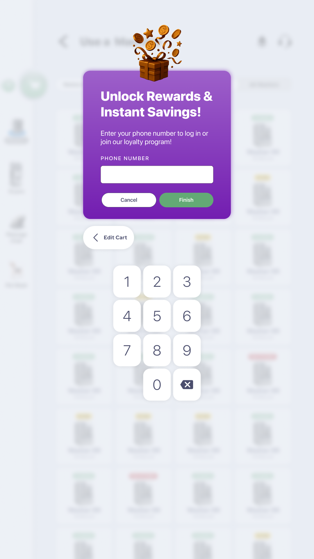
As you can see in the provided example, the Bubblepay Kiosk design does not fully subscribe one way or the other to flat design vs. anthropomorphic design, and tries its best to reconcile both approaches into one cohesive visual language. So while menus, buttons, and whitespace generally appear as flat, the incorporation of coupons as well as 3d visual renderings of machines helps deliver a more anthropomorphic flair for the greater app experience. Additionally, we can also see through features such as the Loyalty Rewards capabilities that this same anthropomorphic approach was used to great effect to help provide emphasis to features and capabilities that we wanted to stand out and feel distinct.
2. Suggest usability improvements as needed – Though certain aspects of the Kiosk system were more or less sorted out, navigation was a standout feature that needed to be refined and made more efficient. Simultaneously, the positioning and sizing of certain screen elements did not consider the physical accessibility needs of short people. Finally, it felt like there were too many damn screens.
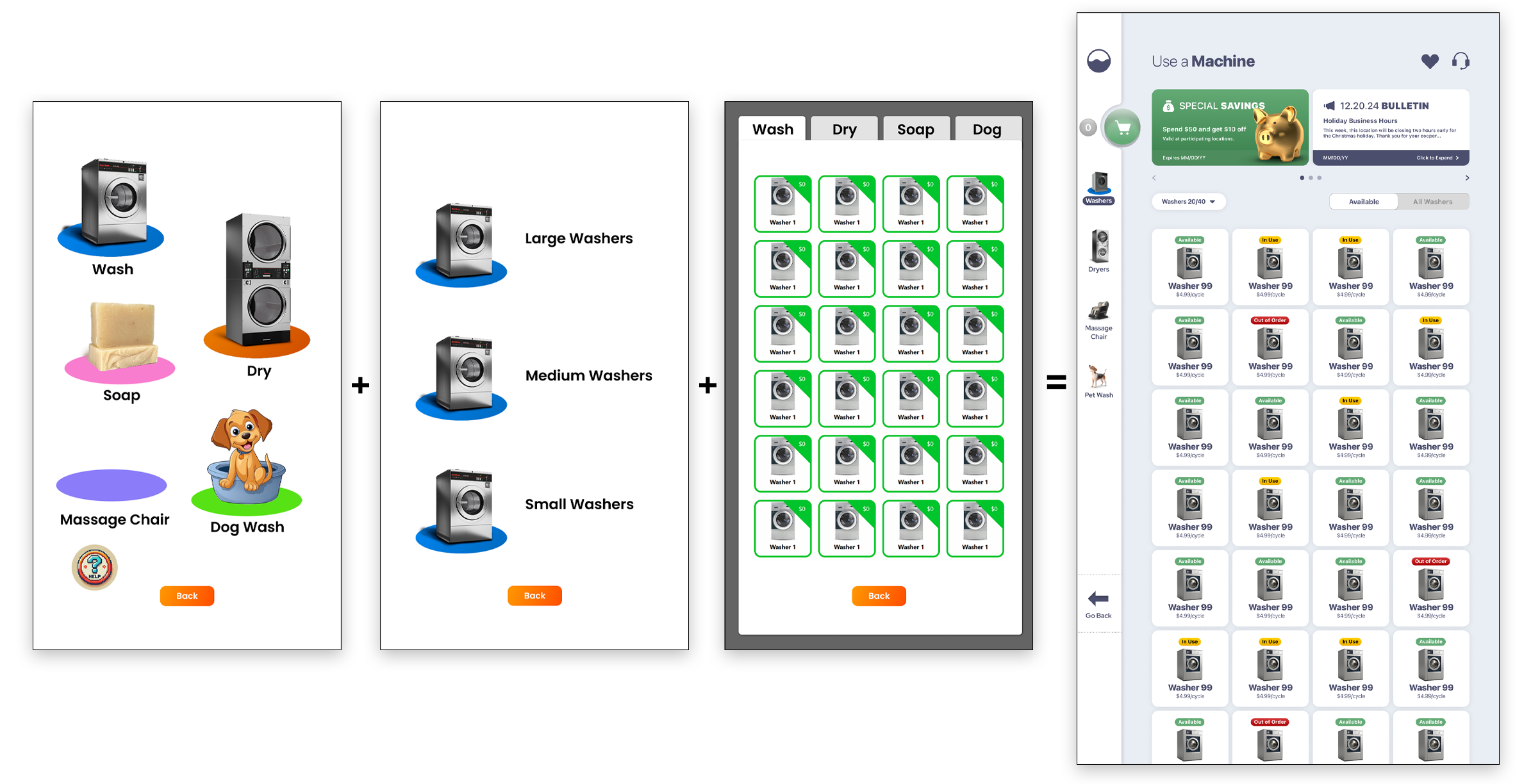
INCREASING EFFICIENCIES
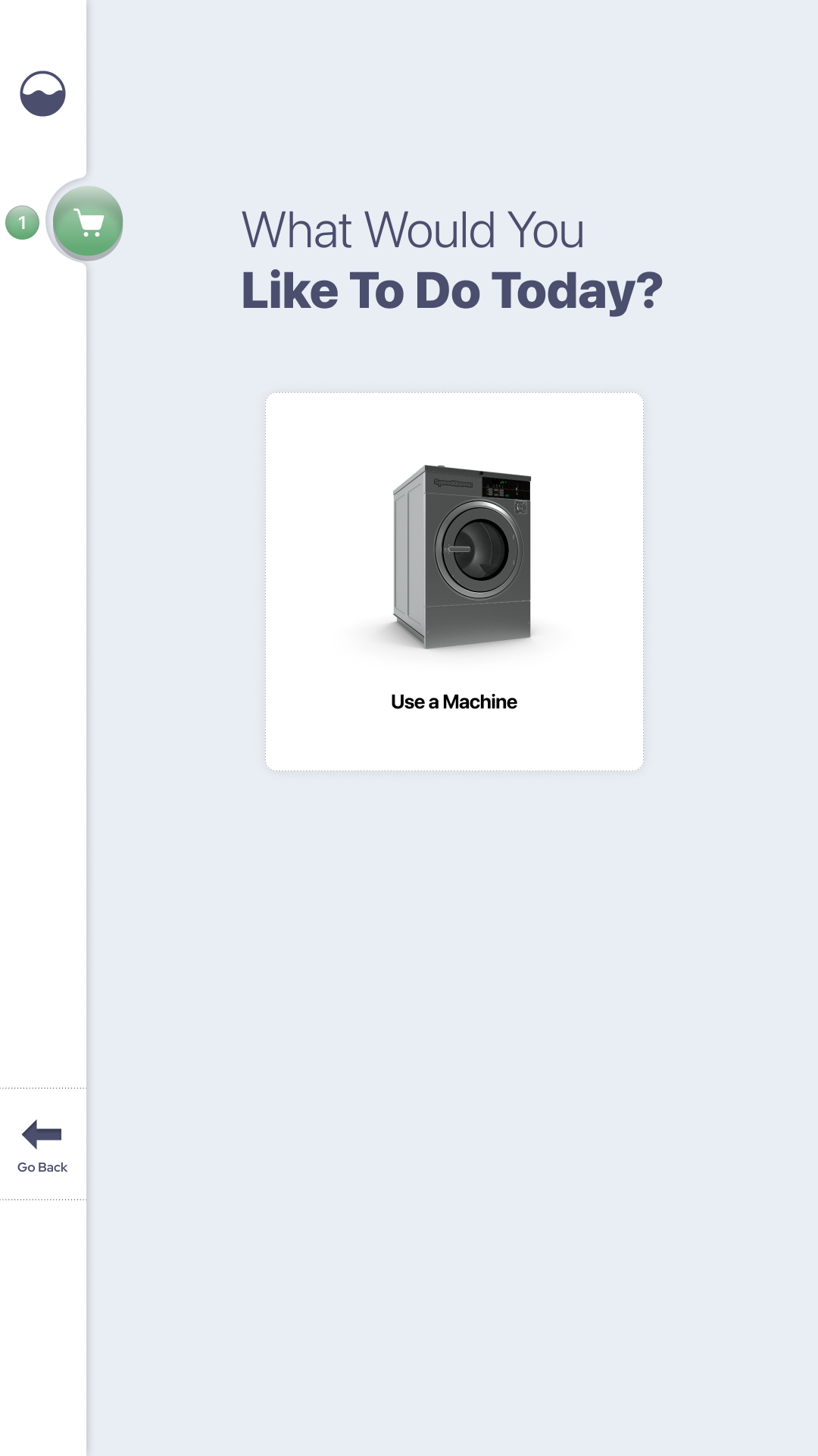
In the above image, we can see an example of how navigation efficiency was increased from the prototype to the shipped product. While the original design featured a multi-screen navigation just to get to the machine selection page, as you can see, this setup is very inefficient. Here we can see how the updated design consolidates a lot of the early kiosk navigation into one screen to enhance the kiosk’s speed of use, and reduce the amount of clicking around.
Ultimately, the process of coming up with an appropriate kiosk design meant starting with a lot—and gradually scaling back. By “a lot” I really mean a lot of everything: be that notifications, color states, transparent menus, menu animations, and more. For a while, the Kiosk experience was characterized in production by its notification-rich, high-entropy presentation that was appealing to the dev team on first brush, but felt like too much for higher ups.
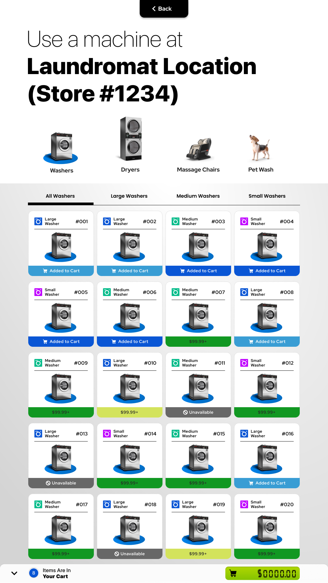
FIRST ATTEMPT
The first attempt at a kiosk design incorporated a more prominent set of visual cues that leveraged both color and positioning. In our first couple of designs, a top-anchored navigation approach was embraced because that was what was used on the original prototype. Eventually, I came to the conclusion that this top anchored approach was taking up too much screen real estate–and ultimately would prevent the user from having access to the navigation at all times while scrolling.
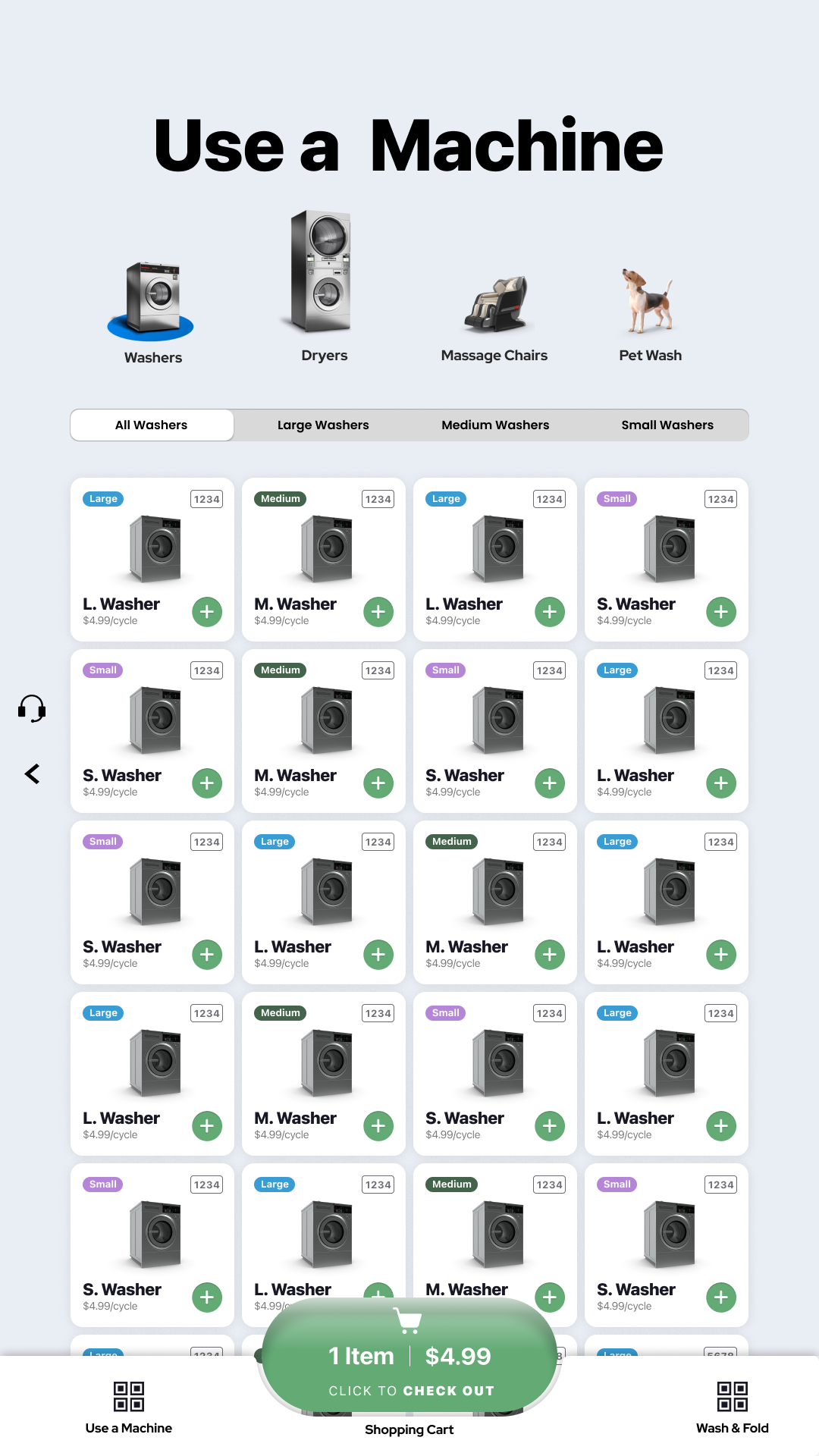
CUSTOMER-APP INSPIRATION
The next step in the evolution of the design was embracing a series of visual conventions that were more reflective of the design system that was being developed for the Customer app. This system was more reflective of a traditional mobile app interface with a bottom-aligned navigation element, labelled navigation anchors, with the center most one accentuated as a “jewel” to direct the user to the primary action–which is kiosk check out, and ultimately, machine activation.
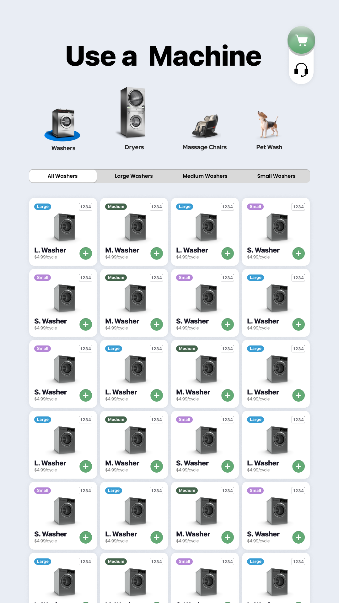
PLAYING WITH POSITION
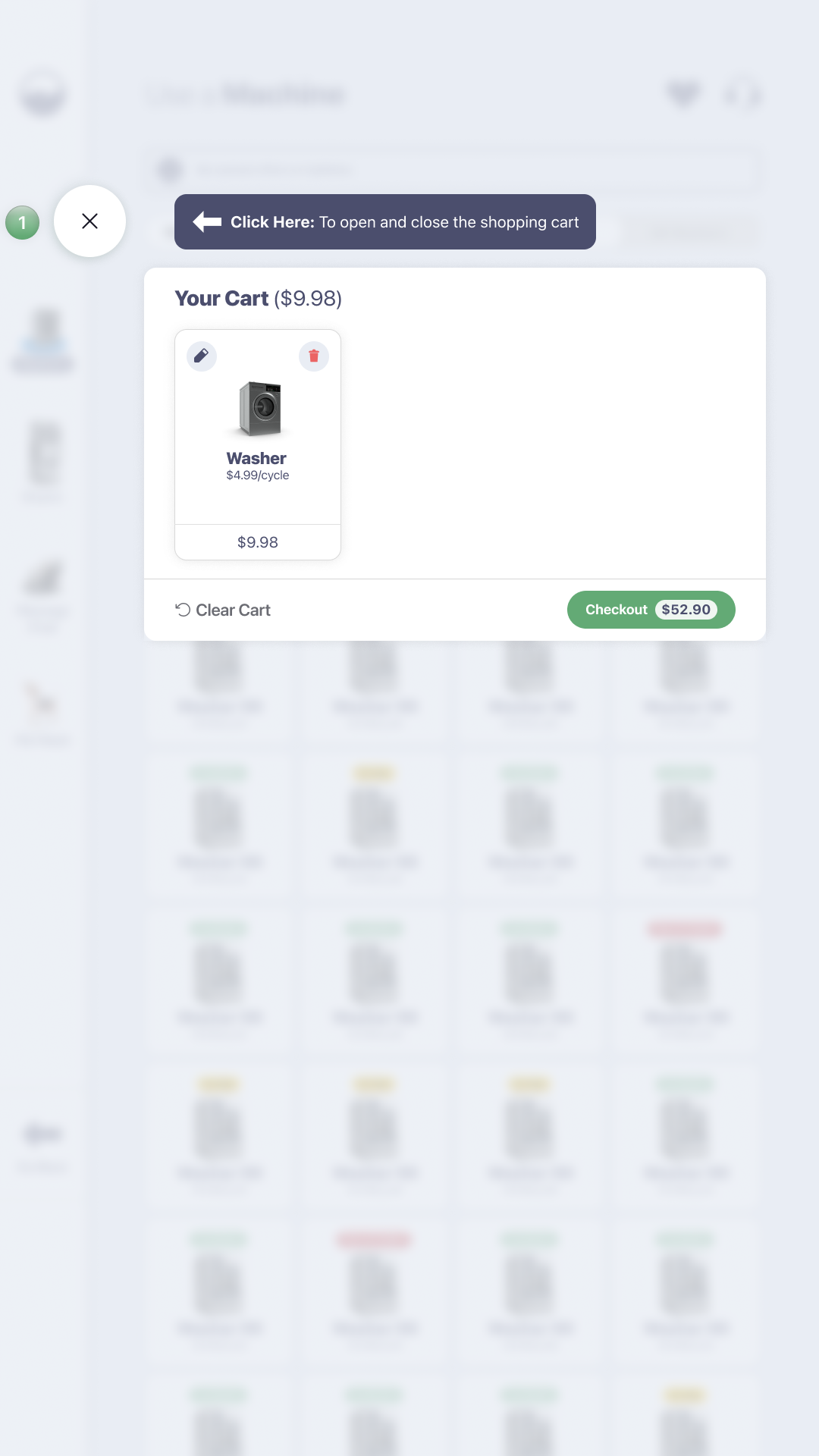
As can be seen, going for a literal re-interpretation of the customer app delivered what could be described as an “excessive” result. Next, we spent time playing with the positioning of the cart element, and testing different locations to see which one worked best. First, we tried positioning the cart in the same interaction area as the customer service button to try and keep navigation to this part of the system out of the way.
In terms of how we scaled back the design, part of that happened intentionally with simplifying the machine tile design by re-organizing useful information, and removing useless crap. The other part of how we scaled back the design was naturally in trying to align the visual considerations made in the kiosk with visual considerations made in the customer app. By chasing this consistency, the design simplified even further and became much easier on the eyes.
COMPONENT EVOLUTION

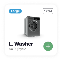


Over the course of production, the visual appearance of machine tile components (as well as other parts of the experience) had to necessarily evolve in order to better facilitate the core functions of the kiosk platform. To this end, we can see how the machine tiles used for each iteration of the kiosk experience can serve as a microcosm of how the design evolved over time–and got progressively simpler with each iteration. While our first tile example all the way on the left, has the strength of being able to relay lots of information in a finite amount of space, the high entropy nature of this design approach can run the risk of coming off as overwhelming to a prospective user. Ultimately, a key lever to the success of the bubblepay kiosk design was going for simplicity, so removing all of the color cues, unnecessary borders, and icon use was our first step to streamlining the experience. While you can see that the size of each machine tile necessarily changed over time as well, the overall size and scale of machine tiles decreased during this process when navigation shifted from a top-anchored nav to a side-anchored nav.
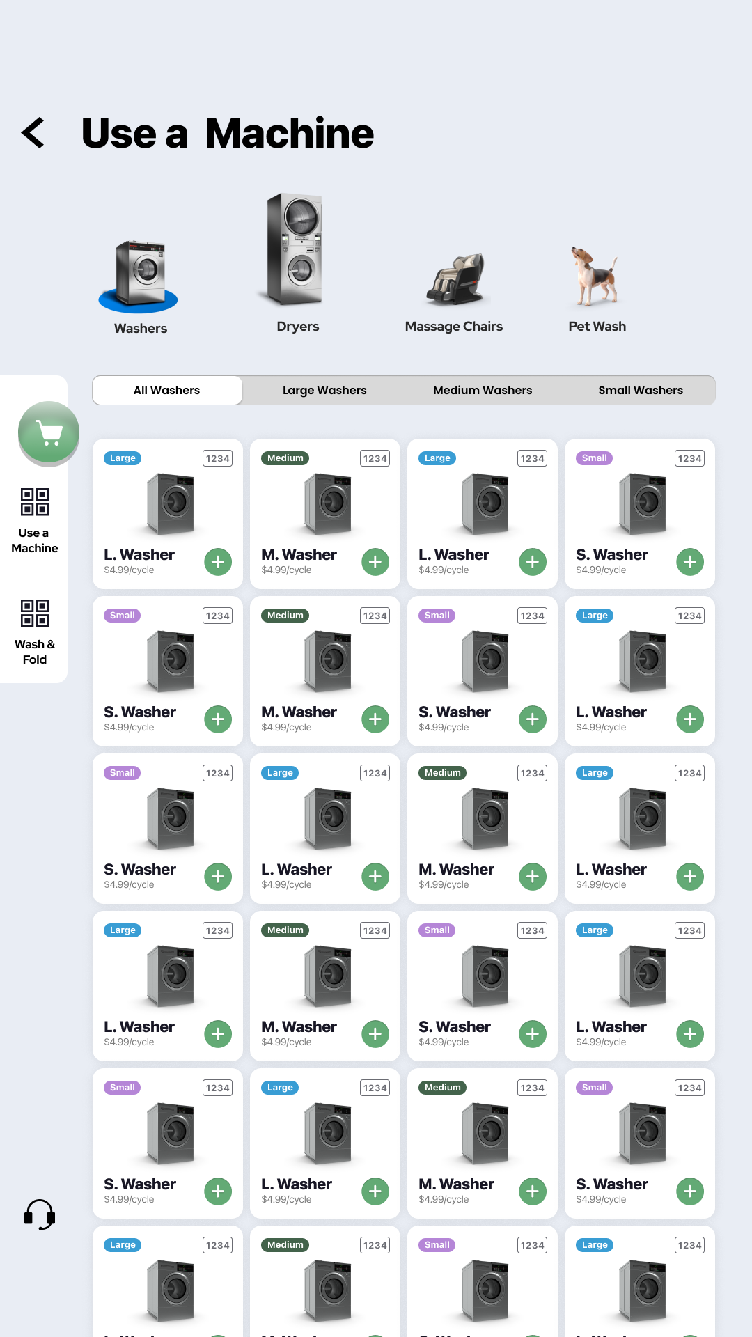
PLAYING WITH POSITION, P2
Here we can see a gradual evolution towards a left-anchored navigation element. But this would start with a minimalist navigation menu that would anchor onto the left hand side of the screen almost like a utility tab. Additionally, we can see some reference to material design navigation specs with the downsizing of the title element, and pairing it with a contextualized back button.
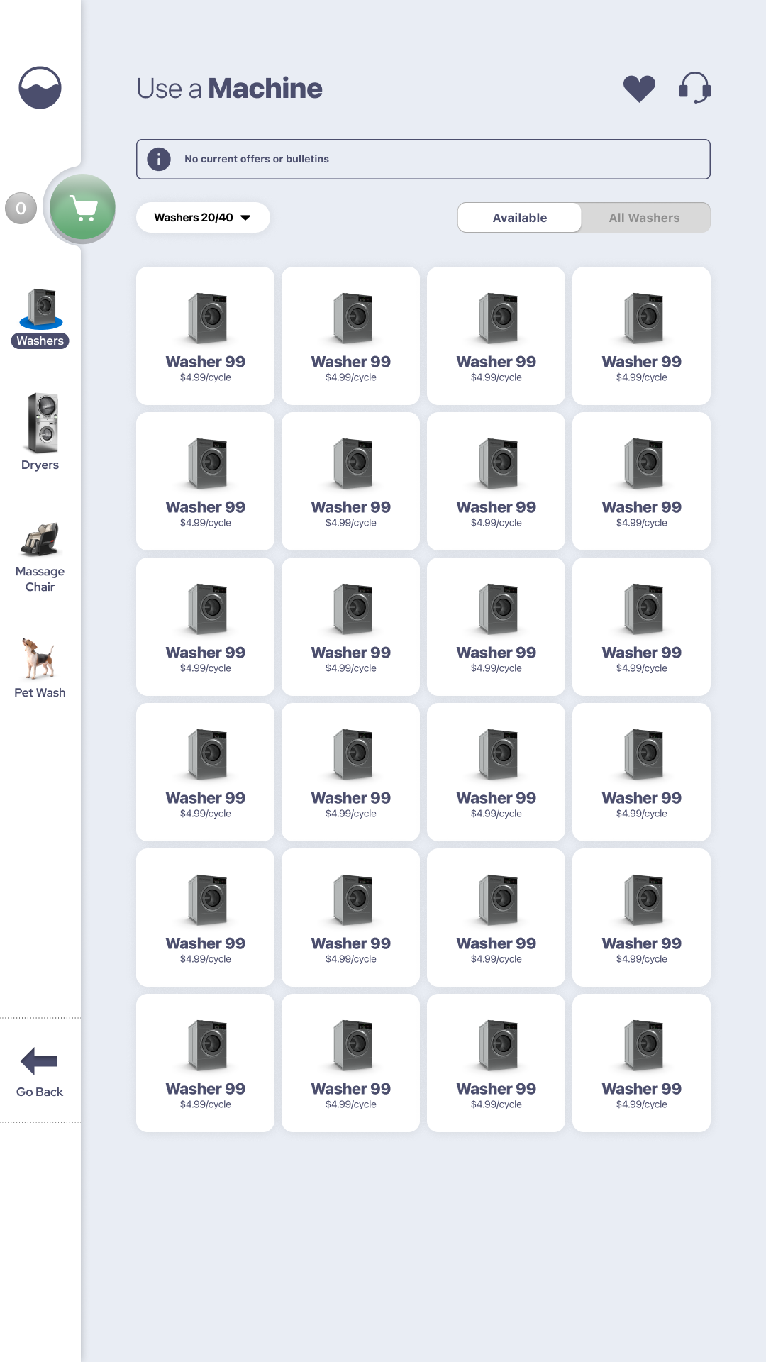
TURNING A CORNER
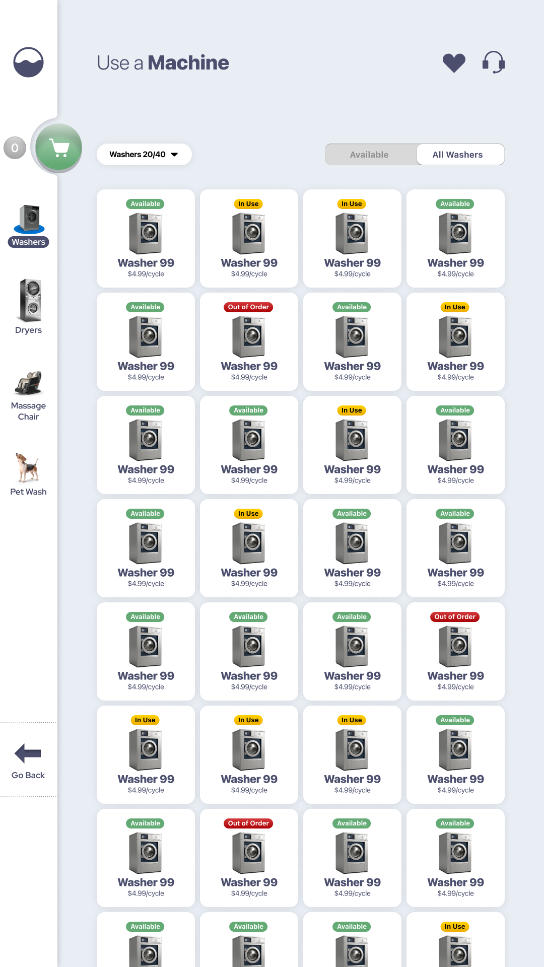
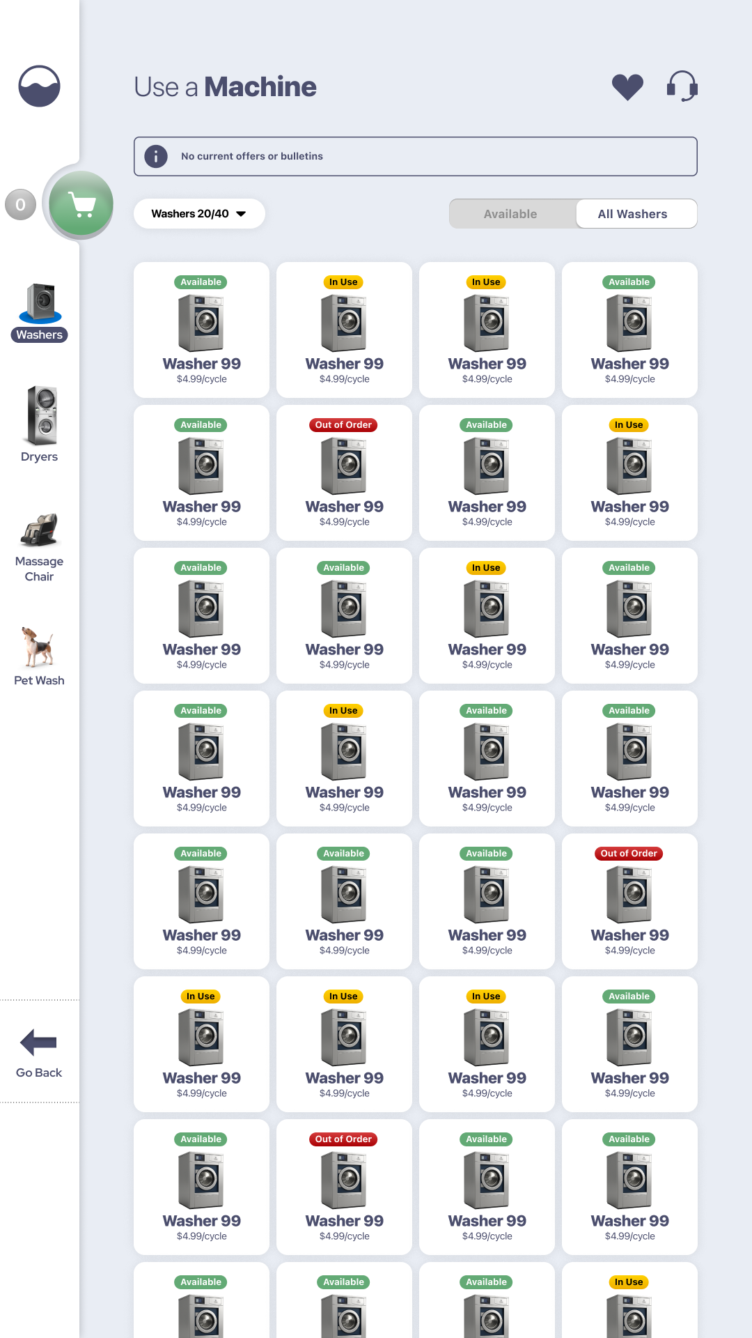
The updated form of the design was a version of the kiosk experience that had all of its color coordinated notification states stripped out of the user interface. BUt it also simultaneously saw some important changes to the design language of the kiosk: 1. navigation was shifted to the right, as well as placed on a static bar to improve nav access no matter where the screen was scrolled. 2. The black point was shifted from black to dark blue to give the experience a visually softer, more refined, and more nuanced look. 3. The machine tiles have been simplified to just a name and a machine status, with all of the other coloration eliminated.
FINAL(ISH) FORM
After coming to the determination that too much color was stripped out of the previous run of prototypes, the final form of the kiosk is defined in some important ways: while it enjoys the simplicity of its color-stripped predecessor, it uses color to a strategic effect to add emphasis to individual machine statuses–a form of operational visibility that was not possible in the previous design. Overall, the final form of the kiosk design was decided as such for its ability to balance artifact simplicity with clean and intentional notification states.
All in all, the process between Ruchira and I during the kiosk experience was highly collaborative and very smooth. Where I would take point in laying out a lot of the main elements of the design—such as the page layout, artifact design, and more—Ruchira would always enrich these designs with clever UX implementations for buttons, menu items, space-saving refinements, and animations. All in all, the project succeeded because we managed to be strong in areas where the other was weaker—and simultaneously learned a lot from one another along the way.
At the time of this writing, the Bubblepay Kiosk has shipped to market, and has been getting used in the field at more than several dozen locations around Australia, and a test location in the United States. While the kiosk is still not yet released officially in the U.S., it is a developed idea that is actively being serviced by the engineering team at Bubblepay—and is a product that Bubblepay is trying to launch state side in 2026.
Make no mistake, despite the history that characterizes my relationship with SMRT, I am glad to say that the Bubblepay kiosk represents one of my most successful works to date. And this includes works conducted for the NCDOJ, UNC Chapel Hill, and the Department of Defense. AS far as the reasons why, they are straightforward: where each of the projects I just listed were high profile, they were also equally as short lived. The work for NCDOJ was relevant for a political season before never being used again. UNC Chapel Hill changes their websites every 1.5-2 years like clockwork, and the project I was doing for the army had lost funding under the 2nd Trump administration—despite being perceived as a home-grown darling project of the entire branch.
By comparison, what makes the Bubblepay kiosk such a success—beyond the scope of my mere inputs—are a variety of factors: first and foremost, the product’s ambitions were well-supported by a team of skilled professionals. This mean that each member of the team was not only given a lot of room to trust each another, but it also meant that anything I or Ruchira came up with had a high probability of getting made. These conditions unto themselves even served as a stark difference from the experience I had while originally working with SMRT, since it never seemed like what I was designing was making it to production—for one reason, or another.
Another reason why the Bubblepay kiosk was a success was that little was left to interpretation by dev. When juxtaposing the actual product that is in the wild to the version of the product we developed in Figma, it is effectively a 90% to 95% representation of the original spec. In my mind’s eye, this is a resounding success as many times, devs can reinterpret everything from spacing to sizing considerations, and ultimately create a debased version of the intended product. All of this is said to say that the Bubblepay kiosk is one of my most accurately depicted pieces of work to date, if not the most.
Finally, this project is a success because it is my first published work that has not only been brought to market, but is actively being updated, improved on, and progressively evolved by the current Bubblepay UX team. To me, having a piece of published work is perhaps the greatest success of all—and more than justified my return to work with Bill and his team. Furthermore, I would say that Bubblepay’s overall embrace of not just my design system—but also my proposed UX improvements—perfectly validates that I have succeeded in meeting the objectives of the assignment. How do I know this for sure? Quality deliverables continue to be iterated on, while the ones that suck get replaced quickly. At this point in the game: I’ve been on both sides of the glass, so I know what success and failure feel like.
Bubblepay (SMRT Systems)
Cliff Brett, Ruchira Biswas, Prakhar Lohiya
UI Design for Applications
Figma, Adobe Photoshop
New York Product Design Award (Silver) - 2025
July 28, 2026
UI/UX design