The Story
February 27th, 2025. I’m sitting at one of the many plain, white, superficially partitioned desks scattered around the SMRT office. My desk, unlike the others around the office, however, has no character—and is completely plain. On one hand, I kind of like having a workspace like this when working in an office. It leaves all of my available area for utility, whether that is looking at documents, having space for peripheral devices—or even just lending myself room to eat—there is a lot of value in keeping a minimalist space.
Now, to be fair, the state of my workspace isn’t a choice. Neither is the fact that my workspace just so happens to be in front of SMRT’s CFO—who kiiinda has a reputation for being a hard ass. Instead, it is a mere reality of being an independent designer who is willing to commute into offices to work with his clients. While sure, it could hierarchically be verified that I have worked for SMRT multiple times in the past, in reality, it is SMRT’s CEO, Bill Alber, that is my client. I come in because he is someone who prefers face time when he’s in town—but when he’s not around, neither am I.
It had been around 2 days since he stepped into the office—as well as when I came in to do work with his team, pick up some new introductions, and directly collaborate with him and Ruchira, his lead UX designer, on a series of advertisements that he wanted to run in a national trade publication. One of the more fascinating aspects to Bill is that he is probably the closest thing I know to a “jet setter.” Rarely staying anywhere for long, Bill comfortably bounces between Raleigh, NC, Malmo, Sweden, Sydney, Australia, and San Francisco, CA—and this is his regular business travel, with visits to each of these places multiple times in a year.
Today, was his last day in the office before going to RDU to fly off to San Francisco, and spend some time with his family. For such reasons, he was spending a lot of time with the various employees at SMRT, talking to people at their desks, reviewing work product and delegating tasks. After completing a few iterations of the advertisement I was working on, I grabbed his attention to show him my work product.
“Yeah, it looks good.” He said in a fairly casual tone. Usually, Bill had more nuanced inputs on things like ad creative, but after enough years of having Denise on staff—who was his marketing lead at the time—it was clear that bill fully trusted her and no longer felt a need to -insert himself in the process. Unlike other periods when we had worked together in the past, Bill’s demeanor this time was very different.
In the past, Bill had the attitude of a clever fox, mixed in with a dash of palpable eccentricity. He always had big ideas, tormented his competitors, and somehow managed remain a step ahead of them for years. As a CEO who fashioned himself as a designer, he never felt out of place collaborating with designers on ideas—and much of SMRT’s Dynamic UX Rules and Triggers have Bill’s fingerprints all over them. At the same time, there were moments when Bill was particular to a fault. This particularity manifested itself in a general disregard of user feedback, a stated preference for waterfall production over agile methodologies and an unwillingness to embrace universal design systems such as Apple’s Human Interface Guidelines, and Android’s Material Design Specifications. Nonetheless, all of this is said to say that in the past, sharing an ad spec with the man would normally yield a multi-iteration back and forth process where he would workshop text, request layout manipulations, and ultimately contour the final product to whatever was most consistent with his vision.
The fact that none of what I just mentioned remotely came close to ever happening unto itself was somewhat jarring. I had never seen Bill in what seems like a state of trust and peace with his team. Trusting professionals such as Denise and Prakhar who can competently manage a lot of the key responsibilities around promoting and building SMRT left bill to be a version of himself that I had not seen before: one that was trusting, calm and without worry.
“Hey, I wanted to ask you something,” He said.
“What’s up?” I responded.
“I wanted to see if you were available to work with Ruchira on some things related to Bubblepay? She is currently working on our Customer app, and Kiosk app, and has some backlogged work with SMRT lite and I was thinking you could join her.. and if you had some time, grab some shovels and pick axes.”
“Oh,” After a moment of thinking about it and realizing he was asking if I wanted to work with his software product, I said “Oh! Yeah, of course! I’d love to.”
“Great,” Bill responded. “I’ll reach out to Ruchira and let her know what is up… But hold off on telling her yourself. Instead, wait for her to approach you with the assignment.” Bill said quietly while winking and smiling.
“Ok, haha, I can do that.”
“Great!” And then Bill walked away. To his credit, I could appreciate Bill not wanting to Step on Ruchira’s toes. After all, as the lead designer, she had spent lots of time and energy shouldering the responsibility of building early versions of the Bubblepay Customer App, The Bubblepay Loyalty App, SMRT Lite, and the Bubblepay Website. Regardless of what my pre-existing relationship was with Bill—and SMRT writ large—it would not have been right to effectively walk in and delegate an assignment to the company’s Lead Designer when I have not been a part of the organizational hierarchy for at least a couple of years. Later in the day, Ruchira approached my desk with a brief that involved working on a Customer app, alongside something I have never worked on before—a kiosk app.
The Team
Unlike the Bubblepay Kiosk assignment, however, my work on the Bubblepay Customer app was characterized by operating on a much smaller team. Where the Kiosk assignment had six people working on it: 1 project manager, 2 designers (including myself), and 3 developers. The team I worked on for the Bubblepay Customer app only consisted of Prakhar Lohia as Project Manager, Ruchira Biswas as the Lead UX Designer, and myself as the UI/UX Consultant on staff. AS far as the devs? We didn’t have any because—spoiler alert—this particular design didn’t actually make it to market.
To be clear, this isn’t to say that the present day team for the Bubblepay Customer app is not comprised of a more complete roster of professional talent—particularly as Bubblepay has released a customer app since my initial efforts—but it is to say that I was not a part of that team.

PRAKHAR LOHIYA
Project MGR.

RUCHIRA BISWAS
UX Lead

CLIFF BRETT
UI/UX Consultant
Company Background
Bubblepay is a digital payment platform for laundromats that facilitates transactions between smartphones and laundry machines.
Originating as an Australian digital payments company that services laundromats, Bubblepay was purchased by SMRT in 2024 with the intention of being launched in the United States as SMRT’s product arm for laundromat payments and wash/dry/fold services. At the time of this writing, Bubblepay has around 400 subscribers between its Australian and US markets, with most of its customer base primarily consolidated in Australia.
Bubblepay’s software ecosystem is comprised in two parts:
Product Goals
The Bubblepay Customer app, in so many words, is designed to serve as the focal point of transactional activity within the Bubblepay payments ecosystem. Beyond the stop-gap use case that the Bubblepay Kiosk is intended to serve, the Bubblepay Customer app is intended to showcase a slate of features that are experience defining, with the customer app being the product required to interface with Bubblepay-enabled laundry machines.
All of this is said to say that in the ideal product vision for Bubblepay, when users think about Bubblepay, they wouldn’t think about the kiosk—and instead, they would think about the Bubblepay app.
If this product vision seems like shares similarities to PayRange, that’s because it does. Similar to PayRange, Bubblepay hangs its hat on an exclusively-digital service model that completely obviates cash, Bubblepay utilizes a standalone App interface instead of one that is web-hosted, and these apps share many practical functions such as the ability to load funds, track funds and use machines.
Beyond a use case that is—at least, for now—exclusive to the Laundromat industry, where Bubblepay differentiates itself is in a couple of areas. On a foundational level, Bubblepay uses a different kind of connectivity standard called THREADS which is purportedly more reliable than PayRange’s WiFi implementation. Bubblepay’s customer app also doubles as a customer loyalty interface that feeds users unique offers and rewards for consistently doing business with an establishment. Finally, future implementations of this app eventually introduced support for brand customizations—but we will talk a little bit more about that later.
In light of these realities, however, the primary goal of the Bubblepay customer app was to be the leading app experience for cashless digital payments in the laundromat industry. Despite what competing organizations are doing, Bubblepay’s motivations for being a leader in cashless payments is different from that of its competitors. While companies like PayRange merely wish to enable digital payments for what may also be cash-accepting technologies, many of these operations will still require the presence of a human operator to properly sustain the business model. By contrast, Bubblepay is trying to use cashless technology to help business owners leverage create completely unmanned point of sale experiences.
The Brief – Intro
In similar fashion to the Kiosk, the customer app had certain details of importance already figured out—such as the scope of UX items needed on each page, the purpose of each feature, and the app’s intended use case. But much like the Kiosk, the Customer App did not have a finalized design system. While the design system for the customer app was not nearly as much of an eye sore as the original kiosk design, an argument could be made for the fact that while it was “clean,” and “modern” it also managed to be somewhat bland and nondescript at the same time. Additionally, features like a seemingly over-reliance on hamburger menus subtly indicated that some improvements to the navigation may be needed.
In terms of hard and fast goals for this assignment, they were equally as straightforward as that of the kiosk:
Similar to the Bubblepay Kiosk, my role in this assignment was necessitated by a need to give some production relief to Ruchira—who was primarily occupied with working on screen developments for SMRT Lite. Despite the nature of my involvement in the project, however, the role I was tasked with was very similar.
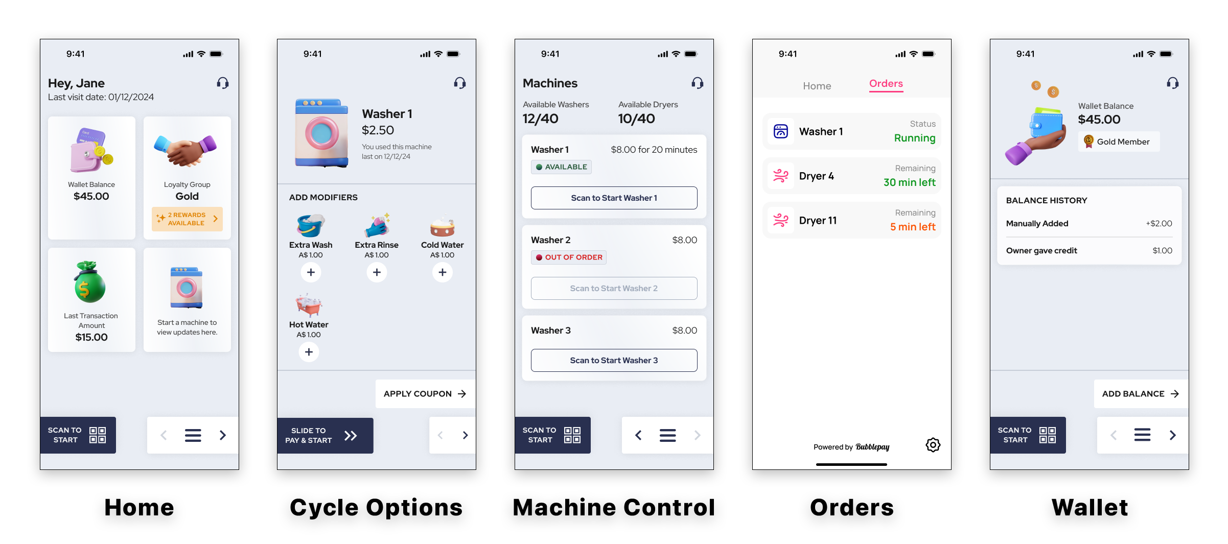
THE ORIGINAL CONCEPT
The above image is a showcase of some key screens in the original Bubblepay customer app. As you can see in the provided examples, this app is hardly a “bad-looking” app, but it does have some clear areas that can benefit from improvement. While the layout is clean, it is relatively light on information. While the colors are subdued, they are demonstrably conservative. Finally, while the app certainly wins points by prioritizing the primary action of scanning machines, it also forces a lot of primary navigation options into a hamburger menu, making this a demonstrably “2-click” navigation experience.
Finally, while this was not an explicit goal of the assignment, an implicit goal was understanding that this application would be part of a broader software ecosystem. With this understood, the visual and experiential considerations made while developing this product would go on to inform the way supporting products would be designed. Ultimately, this meant that if there were any ambitions to have a visually cohesive experience, then the componenture for the Customer app would have to be developed and edited in the context of the entire software experience—and not just one app.
Process
Something that is not immediately perceptible when looking at both the Customer app and the Kiosk is that instead of making one design after the other, each of these designs were made in fairly close conjunction with one another. Our reasoning for this was relatively simple: Despite the organizational benefits of a more ordered, chronological, approach, trying to build the customer app—and then the kiosk app after it—would have potentially risked investing production assets into layout considerations that didn’t effectively scale across devices.
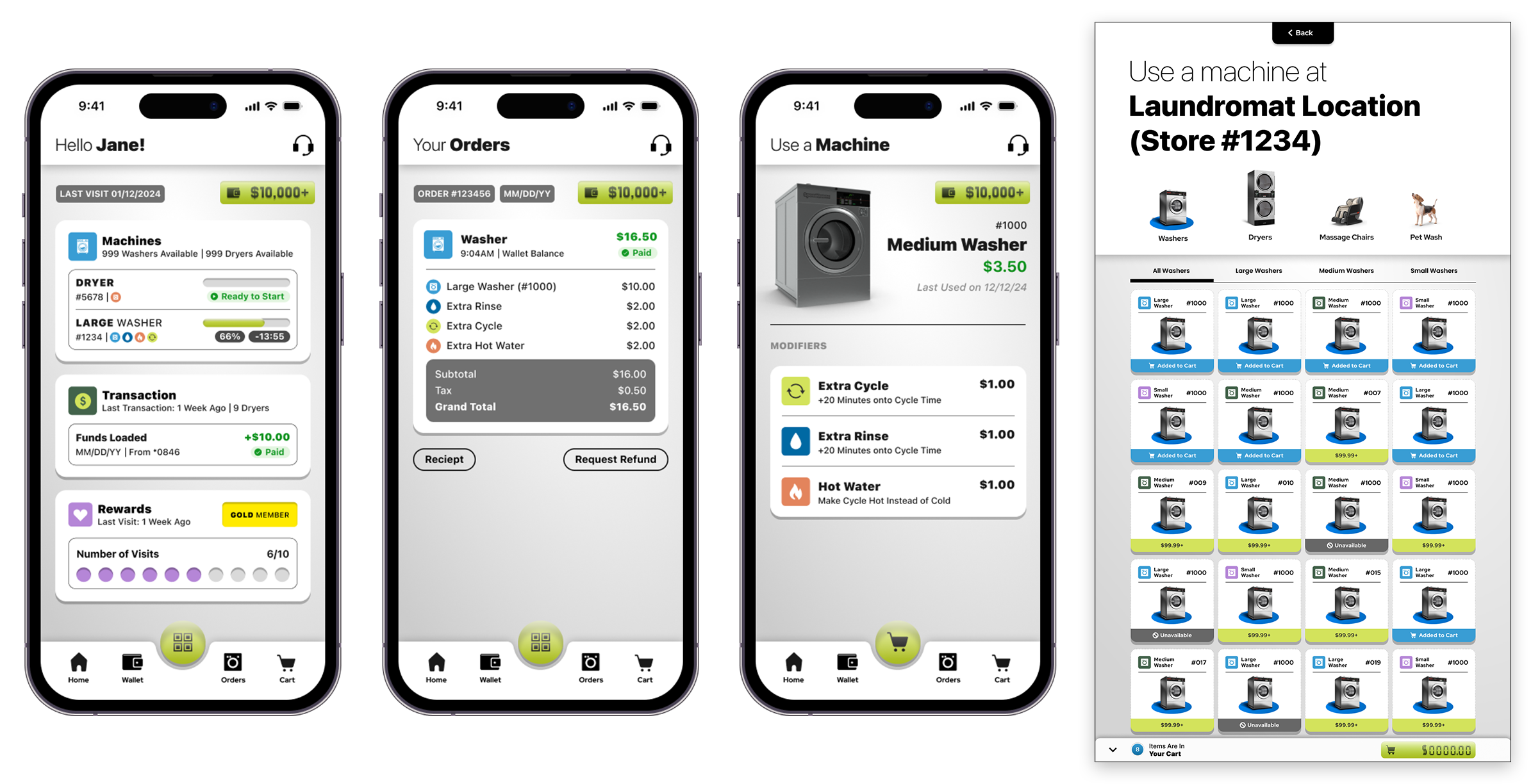
PARALLEL DESIGN, PART I
The above image is a brief showcase of some screens from the early designs of the Bubblepay Customer App—and showing how these early design ideas translated to the Bubblepay Kiosk. In early concepts, I leaned heavily into an anthropomorphic design language that heavily played with depth and texture. Also, I incorporated additional machine states to give users a higher level of visibility into the status of machines–and which ones are available to use. While obviously, differences in device size, and use case application ultimately meant making necessary divergences in visual language (such as, in the choice of icons in the app vs 3d renderings in the kiosk), visual continuity is nonetheless held with consistent uses of gradiated assets, heavy, sharp shadows, and glassy UI elements such as the primary action button, as well as the wallet display which was visually inspired by a digital LCD display. But, as you can also see, this design is very busy!
For such reasons, the development of key assets within the Kiosk experience happened alongside the Customer App experience—with developments on the customer app leading the developments on the Kiosk… at least, for a while. Early UI explorations would start with a general design for key pages within the customer app—such as the machine page, wallet page, and loyalty rewards page—to try and establish a viable design system. After a tentative design system was produced, I would adapt it to accommodate the visual needs of the kiosk experience to see how well it scaled across device types and use cases.
This process, however, wasn’t just a one-way street of me designing things. It was also an exchange of skills and perspectives between Ruchira and myself. Despite being brought in to use my distinct eye for creating palpable depth and texture in the app experience, Ruchira’s strengths resided in the arenas of scale and positioning—places where I was historically weak in my own interface designs. This meant that where I shared with her my particular take on creating texture through the intelligent the use of gradients, shadows and creative layering practices, Ruchira shared with me her perspective on layout design—which in her mind, relied on giving key interface elements the appropriate amounts of visual “space.”
It was through this perspective that I realized one of the key issues with the interface designs I had worked on in the past—as well as the design I was putting together for both the customer app and the Kiosk at that moment: everything I was making was too fucking dense. Instead of giving each piece of the interface its appropriate room to breathe, lots of designs I had worked on were heavy on color states, icons, text hierarchies, and borders. And while these things can be visually reconciled with object scaling, there is still a clear point where having all of these things in a user interface becomes far too much for the average user.
A major breakthrough in our design process came after I arrived in the office one morning to see that Ruchira had attempted to combine some of her layout considerations with some of my layout considerations—and ultimately delivered a cleaner product that looked more visually subdued while still looking complete in the same brush. After trying this idea with the home page, I decided to move forward with the look and re-create the customer app’s entire design system around Ruchira’s visual updates.
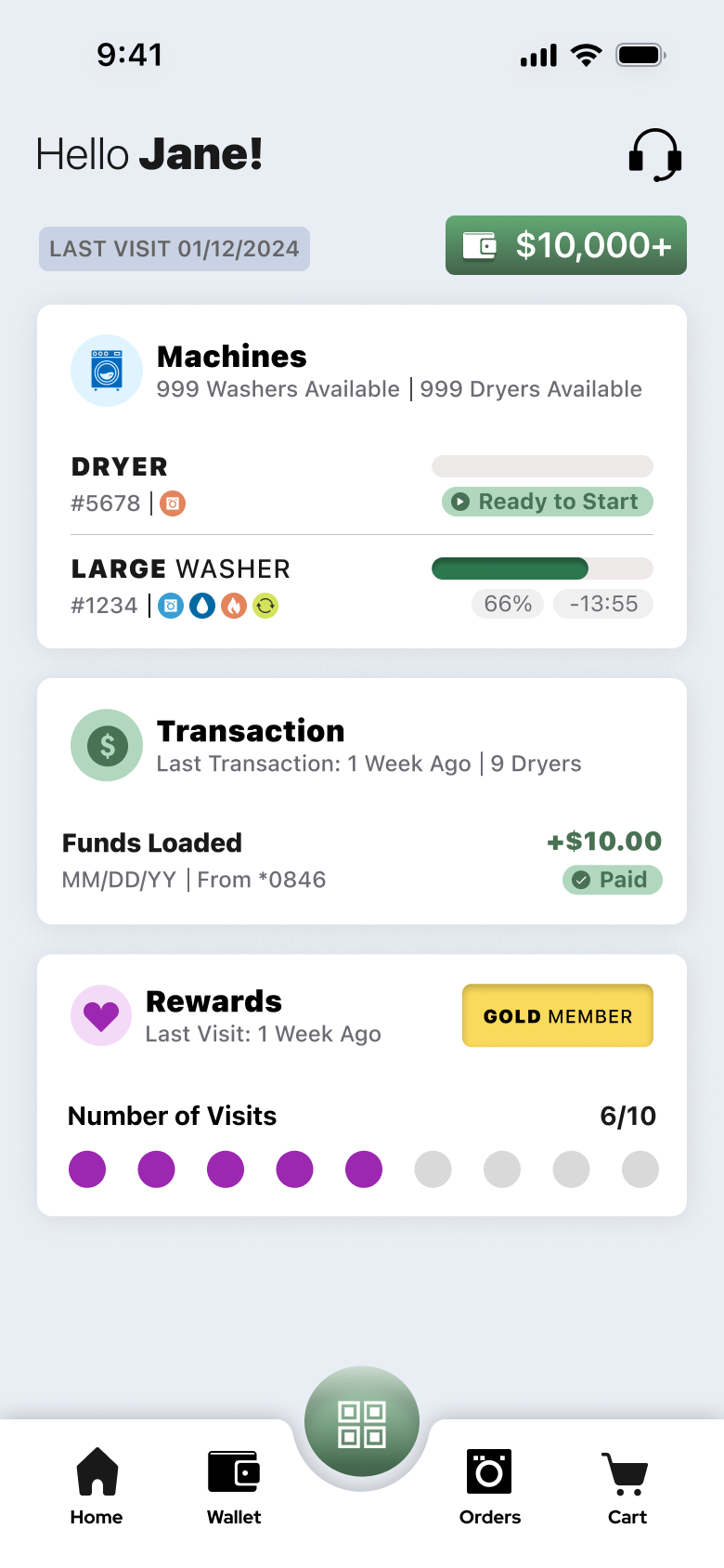
At the same time, this visual update had the knock-on effect of re-shaping our approach to the design for the Kiosk. Earlier versions of the Customer app design featured UX elements that had rounded edges and sharp shadows, giving each component a smooth yet substantial visual presence that aesthetically took after the form factor of dominos. At the time this design system was developed, these same visual sensibilities were transferred over to the kiosk experience.
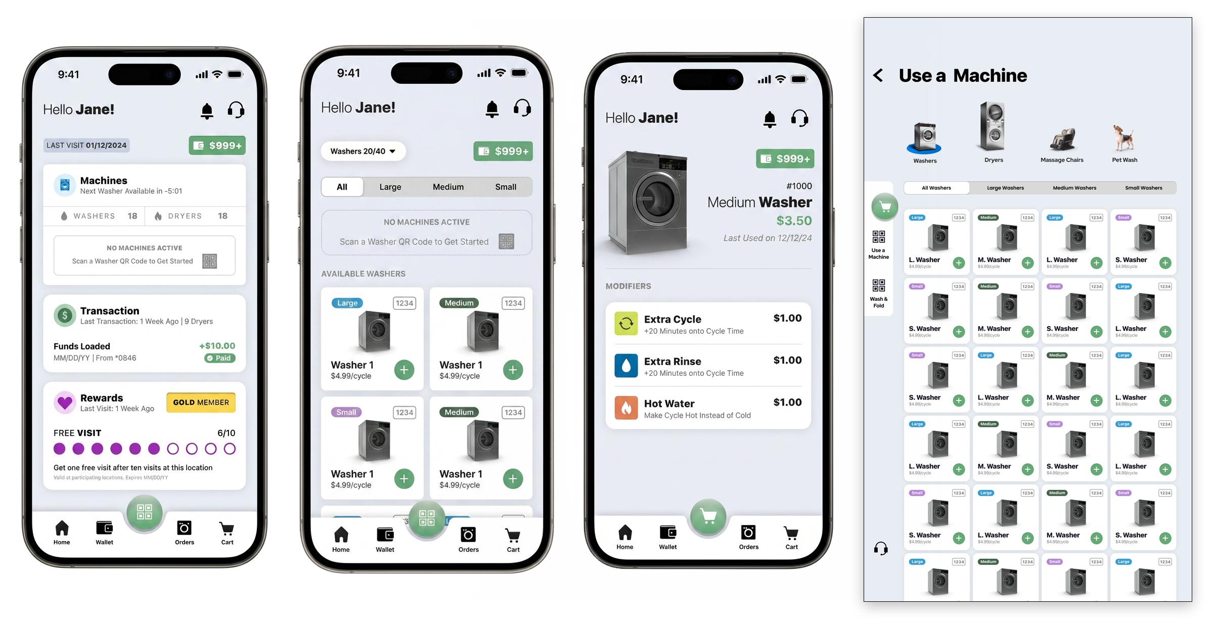
PARALLEL DESIGN, PART II – THE FORK IN THE ROAD
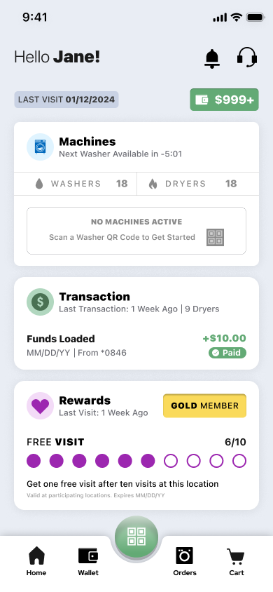
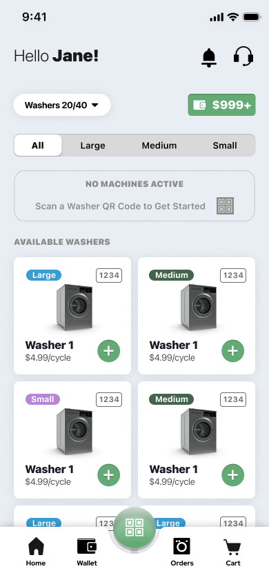
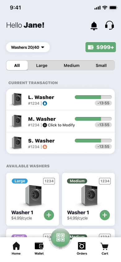
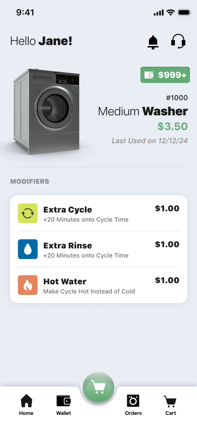
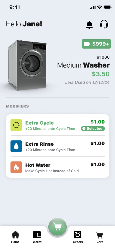
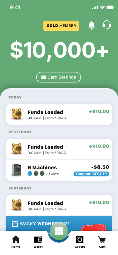
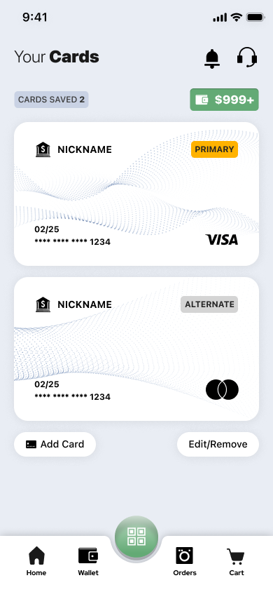
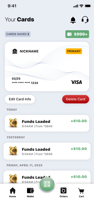
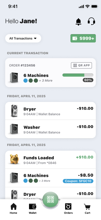
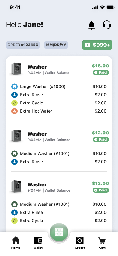
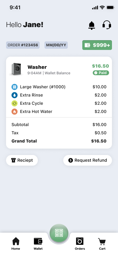
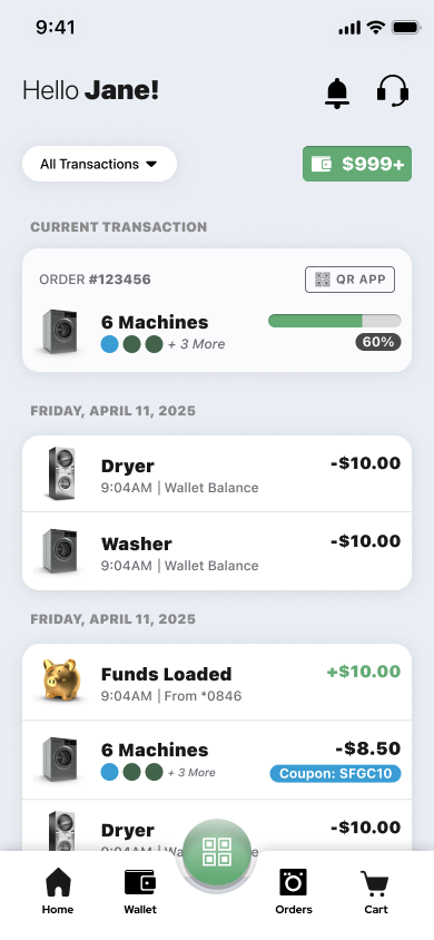
This second image progression shows how Ruchira’s contributions affected my approach to the design of the customer app moving forward throughout the remainder of the project. While I liked some of her changes to the individual object tiles on each page, I went back to the sea foam green action button because it was a visually softer element that was less heavy on the eye. Simultaneously, I created a new machine tile design with the intention of it being translated 1 for 1 into the kiosk for absolute visual continuity. Ultimately, however, as the Kiosk design started to take off and require more attention, the design for the Customer app began to lag behind–and when it came time to return to the project, it was already in the process of being completed by Ruchira. Simultaneously, the design for the Kiosk–despite its quality–became increasingly out of step with the intended design for the app. In the end, this generation of prototypes truly represents the last visually continuous design between the kiosk and customer app.
What made this updated approach so potent was that it took some of the sensibilities of flat design and managed to successfully combine them with light touches of anthropomorphism. So while major sections of the design system seemed flat, this flatness was balanced with light shadows, the intelligent incorporation of layered gradients, and other minor touches to help bring that sense of felt “depth” the rest of the way.
As one may suspect, developing this visual update to the customer app also necessitated that these same updates would need to make their way over to the Kiosk design as well to ensure a visually complete experience. To this end, the design I made with ruchira went through two generations of parallel updates with the kiosk before diverging from the broader app ecosystem design process, and effectively becoming its own project. To be clear, while this wasn’t my preference—this was how things ended up in the end, for better or for worse.
Conclusion
In the end, while my contributions to the design of Bubblepay’s Customer App did not culminate in the form of published work product, I don’t explicitly consider this project to be a failure—even if it did feel like the project derailed into something else in the end. My reasoning for this is simple: through what frustrations I may have had regarding my incomplete involvement in the Bubblepay Customer App, it ultimately improved my skills in mobile user interface design by leaps and bounds.
In the years prior, my skills in interface design tended to face the challenge of not having very good object spacing or object scaling relative to the size of the screen that a particular interface was intended to be seen on. This would result in interfaces that, while “attractive” featured elements that had a measure of visual oafishness to them… so despite the fact that a particular element or component was visually or operationally well designed, the fact that it—and items scaled relative to it—all seemed slightly larger than necessary at their intended resolutions would detract from the perceived quality of the experience.
All things considered, the work that I did produce on the Bubblepay Customer app marks a qualitative shift in all of the interface work that I have done to date. This is a major reason why I believe that this project is still very worthy of a portfolio entry, despite the fact that none of this work actually ever made it to market.
In the lead up to my time working on the Bubblepay app, my interface design knowledge was primarily informed by working completely from scratch—and effectively building design artifacts from nothing. On one hand, while working this way gave me a very nuanced concept of how to build certain looks and effects from square zero—and ultimately, build a very deep tooling repertoire—this approach did not come without its own drawbacks.
In Ruchira openly admitting to me that much of her iterative production work leaned on the use of interface kits, unbeknownst to her at the time, she managed to solve two major issues that I faced as an interface designer—and almost instantaneously upgraded the qualitative baseline of all my design work. Ultimately, it is because of this massive qualitative leap in my work product that I do not bill this particular endeavor as a failure.
That being said, however, I absolutely believe more could have been done to effectively reconcile the customer app to a shared product vision with the kiosk. To be clear, I understand why the final product for the customer app ended up being the way that it did: despite the strengths of my original designs, there was a strong interest among stakeholders to have branded customization features within both the kiosk and customer app. Because the kiosk was already well into development when the final design for the customer app came down the pike, when the customer app finally made it to development, it not only had an updated slate of features, but also a completely different design system than what had been so painstakingly established over the course of the months before. In the end, the Bubblepay experience as it currently exists at the time of this writing, is marketed with two application experiences that not only look visually uncomplimentary—they look like they belong to two completely different apps.
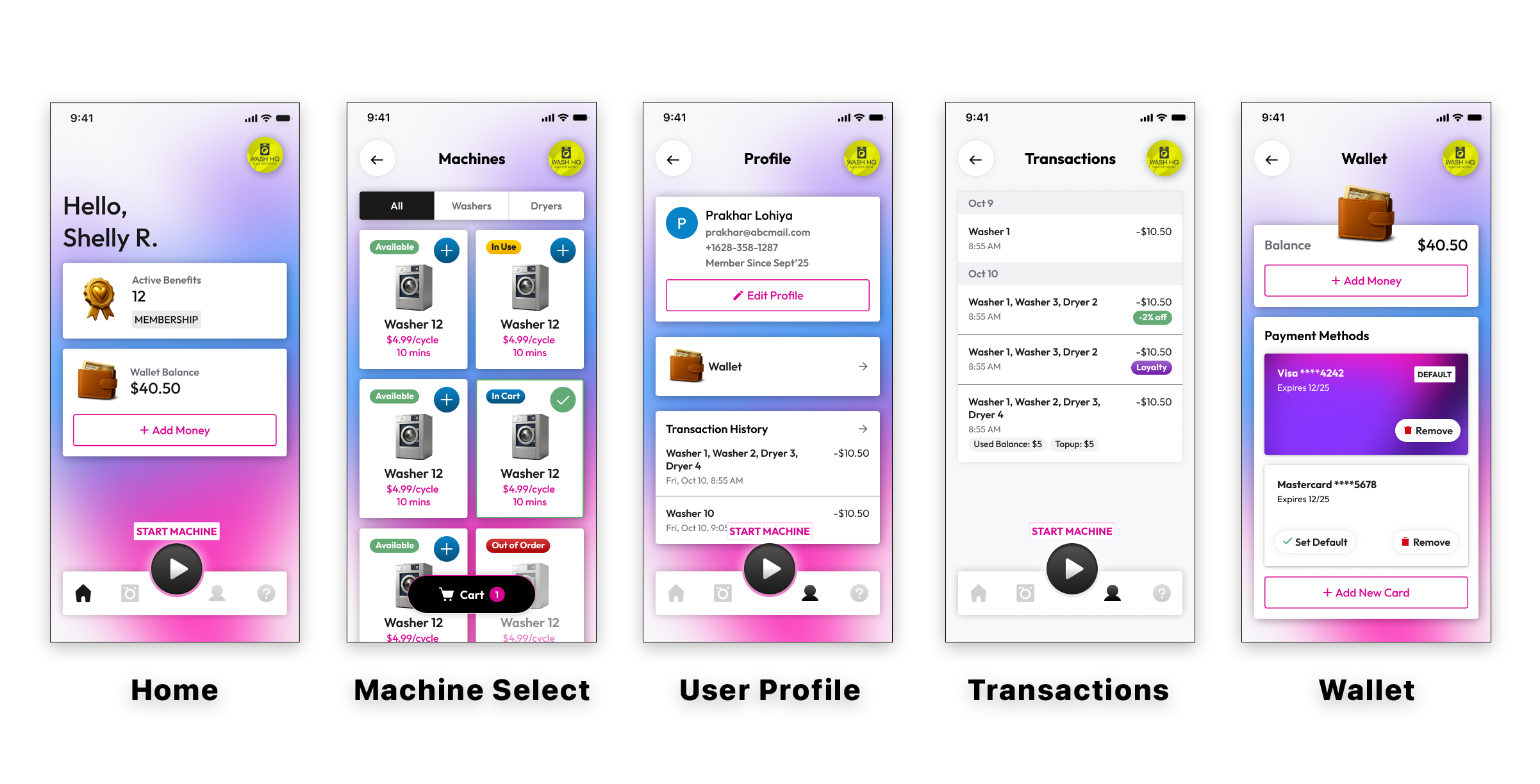
On one hand, though it can be readily said that this visual mismatch in software experiences between the Kiosk and the Customer app is a predictable effect of agile production methodologies—which have been a net positive for SMRT—it is worth noting, nonetheless, that this where iterative production practices can fly in the face of professional-looking software releases if mismanaged.
If it feels like I am being unnecessarily particular, here’s the reality: software ecosystems do not merely exist as such because of individual pieces of software sharing compatibility and interoperability with one another. What also dictates an ecosystem effect between two pieces of software are if those software releases simultaneously follow the same (or complimentary) branding touches, screen states, and visual cues for interactivity—and this perception of relevance is not only what helps users use software, but it also directly contributes to how effectively that software can even be marketed or sold.
In the case of the Bubblepay Customer App, I think it is clear that pushing to release the most advanced version of it in isolation—as opposed to as part of a sweeping update across kiosk and mobile—was an unforced error that made Bubblepay look inexperienced and unprofessional. Regardless of the esteem that I may have for each person on the Bubblepay app team—as well as their individual scope of professional capabilities—I really don’t give a shit if my assessment of this product release sounds harsh. The fact of the matter is that when interfaces are poorly or inconsistently designed, it challenges a user’s ability to not only perceive that product as useful, but it also challenges the perceived trustworthiness and credibility of that product. In the case of Bubblepay, there is no question that their product is well designed, but they spent the better part of a year marketing a customer app experience that looked visually inconsistent with the kiosk in a variety of clear and obvious ways—and acted like it was completely fine.
And if it feels like I am complaining about nothing, the point I am trying to make is that believing these creative choices don’t manifest in tangible business outcomes is a plainly naïve disposition to take.
Ultimately, this is what I meant earlier when I alluded to the idea that this project ended up “derailed” towards the end: Its not so much that I care about whether or not I was working on the Customer app all the way until a formal hand off with dev. Rather, it is in seeing what the work became after I stopped working on it—and how the updated customer app effectively blew up the entire design system for the app experience across platforms. Its not that I think the updated design is ugly, unprofessional, or fundamentally less functional so much as it is that it completely flew in the face of what was already approved for the ecosystem. To take this a step further, fixing this issue will ultimately mean doing the extra work of yet another design update for the kiosk—which is in the market currently—and it has already meant re-branding the Bubblepay brand to be more visually in line with some of these creative choices in the product. And while all of these decisions are the correct ones to commit to, the point I am making is relatively simple: this is a lot of shit to do over a fucking screen update.
Many of the thoughts I am sharing with you about the updated design system have already been shared with the team at Bubblepay, so if you think I’m just running my mouth on the internet: don’t worry, they already know I don’t like how the customer app updates were implemented. All I’m doing is providing a more nuanced view of this project’s outcome beyond “woe is me, my components weren’t used.”
Maybe that sounds trivial, but I think it’s important. The reason why is because on the other side of such observations is ultimately what helps inform one’s long-term capacity to work in this space–whether as a staffer, a leader, or a consultant. Over the course of almost 20 years as a professional designer across the disciplines of print, web, and now applications, I have learned that professional maturity is largely a function of reconciling one’s role in the broader process, owning it, and being okay with it. The beauty of this reality, is that designers can also be many things in an organizational hierarchy: founders, behavior analysts, marketers, researchers, and problem solvers. But for all of these wonderful responsibilities that can encompass our job, none of them explicitly involve educating the client.
For many–including some clients–what I am saying may seem like an unnecessarily hands-off approach that feels like it borders on hostility, but that’s really not the point. Experienced professionals can tell you that many times, regardless of what discipline a designer specializes in, the insanity of this job tends to revolve around getting clients to make “the right decision”–whether that is picking the right rendition, the right process implementation, the right brand color, the right UX trigger, or something else. These same designers will also assert that getting clients to make the “right” decision often depends on whether they have sufficient education in aspects of feature design, user flow, or even aesthetic principles to inform their judgment.
But anyone who has spent enough time in this field will tell you: that’s simply not how clients work.
Sure, there are obvious exceptions to the rule: There are the government clerks who “just want to learn” and completely soak up the judgment of creative consultants. There are companies that have reached design maturity, and as a result have great levels of trust in their creative employees. There are organizations that are design-led, and use creative practices as well as nuanced design thinking to drive all their business outcomes. In reality, however, most of those government clerks are going to want a blue website, and when you leave, they will load it with cheesy stock photos. Those design-mature companies tend to not only hire for elite talent, but many times that talent will complain about how limited the scope of their work is. Finally, most companies aren’t design-led: most companies are led by autists, sociopaths, micromanagers, and bean counters.
The point I am making is simple: educating the client plainly doesn’t matter if the client wants what the client wants. And to a large degree, no amount of education will make up for this fact, when all the education provided by the designer will ultimately be synthesized through the experiences, emotions, and intellectual context of the client. To be clear, this isn’t me saying “fuck you” to the client, so much as it is me saying that the role of the designer is not one of an educator trying to guide the client to “the right decision”–the role is that of a consultant, using their expertise to furnish the client with legitimate options on how to move forward. Ultimately, how they move forward is their own choice.
Would it be wise for clients to trust their designers? Sure. Are increased levels of client sovereignty in the decision-making process a likely effect of design seeming more pedestrian to people? Sure. Is it possible for the client to absolutely fuck their work up while being empowered with making their own decisions? Sure. But so long as the designer is giving the client options on how to NOT fuck their work up, that’s really all that matters.
That’s not resentment, that’s restraint. That’s not sabotage, that’s sanity. That’s not petulance, that’s peace. Does it consistently lead to portfolio entries that are awe-inspiring? No. Does it consistently lead to perfect case studies? No. Does it consistently lead to perfect datasets and profound conclusions? No. But I’ve found that it does lead to customer satisfaction. It does lead to longer client relationships. It does lead to healthier team dynamics. At the end of the day, design is a business skill, and how people will leverage it will differ according to the needs of each person’s business. To this end, the role isn’t to teach, but to consult: to affect the things you can change, accept the things you can’t change, and exercise the wisdom to know the difference.
After all, if you really want control over the output, just start your own project.